Search the Community
Showing results for tags 'CSS'.
-
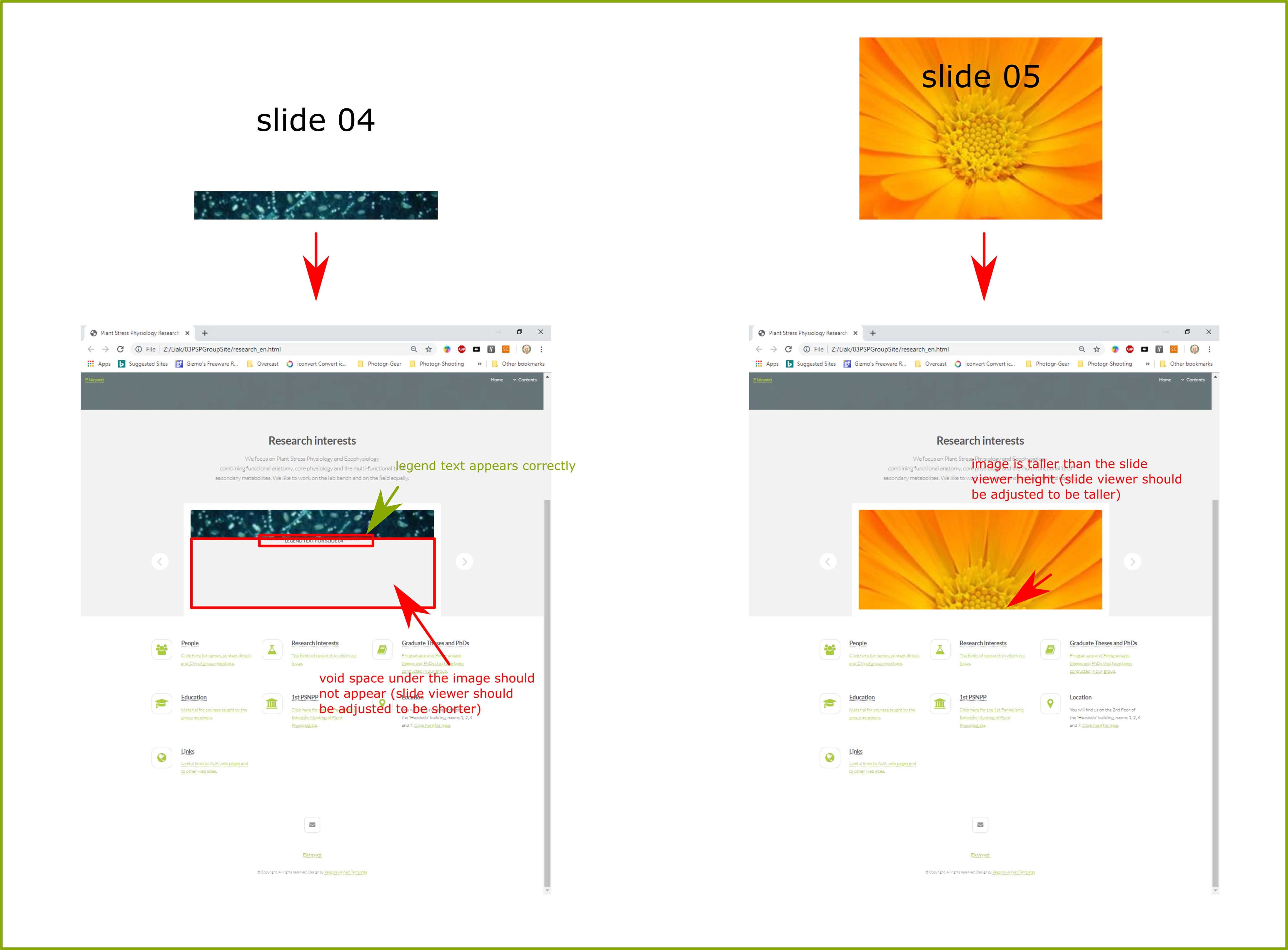
I am trying to adjust height (manually or automatically) of a slider in css. Problem is that images shown may be shorter or taller than preset and they also carry a piece of text that should be displayed. I attach html, css and a set of screenshots with explanations. Thank you! research_en.html style.css

-
I create a modal box that when the user clicks on the button the modal will appear with animation. When the user clicks on the close button ( located on the right side of the header area ) or anywhere of the screen except modal box it will disappear without animation. I want that the modal will disappear/hide with animation. I create two CSS animation. One is animatetop which I already used when modal will open and another is animatedown which I want to use when modal will disappear. But, I can't understand how to do that? See the code on JSFiddle <html> <head> <style> .background{ display:none; position: fixed; z-index: 1; height: 100%; left: 0; top: 0; width: 100%; padding: 100px; background-color: rgba(0,0,0,0.4); } .modal{ background-color: white; position: relative; border: 1px solid #888; box-shadow: 0 4px 8px 0 rgba(0,0,0,0.2),0 6px 20px 0 rgba(0,0,0,0.19); animation-name: animatetop; animation-duration: 0.4s; width: 80%; } .header{ width: 100%; padding: 8px 20px; background-color: crimson; color: white; } .footer{ width: 100%; padding: 8px 20px; background-color: lime; color: white; } .middle{ width: 100%; padding: 2px 20px; background-color: white; color: black; } h2{ margin: 0px; } @keyframes animatetop { from {top:-300px; opacity:0} to {top:0; opacity:1} } @keyframes animatedown { from {top:0; opacity:1} to {top:-300px; opacity:0} } span{ float: right; color: white; font-size: 28px; font-weight: bold; cursor: pointer; padding: 2px 5px; } </style> </head> <body> <button onclick="modal()">Open Modal</button> <div class="background" id="MyModal"> <div class="modal" id="modal"> <div class="header"> <span onClick="a()">×</span> <h2>Header</h2> </div> <div class="middle"> <h1>Modal</h1><br> <h1>Popup Box</h1> </div> <div class="footer"> <h2>Footer</h2> </div> </div> </div> </body> <script> background = document.getElementById("MyModal"); function modal() { document.getElementById("MyModal").style.display = "block"; } function a() { document.getElementById("MyModal").style.display = "none"; } window.onclick = function (event) { if(event.target == background) { document.getElementById("MyModal").style.display = "none"; } } </script> </html>
-
I am trying to use a video background (Vimeo iframe) in a DIV, but I cannot get it to fill out the DIV as I want to save my life. I am working from an HTML template and I am an intermediate user at the most. here is a screen capture of what it is doing at the moment when I scale the browser window to check responsiveness: DIV scaling. (the video content almost looks like a still picture, but it's in fact a moving video) What I am trying to do is: The video should be locked to the bottom right corner of the DIV. The left OR the top side of the video should be cropped, depending on the aspect ratio of the DIV. Why am I not getting this? I first thought that it might not be such a big deal, but it just won't work. could anybody help me with this? here is the HTML of the DIV: <div class="imageblock__content videobg col-lg-6 col-md-4 pos-right" data-overlay="0"> <iframe src="https://player.vimeo.com/video/372864200?background=1" style="position:relative;right:0%;bottom:0%;width: 120%; overflow:hidden" frameborder="0" allow="autoplay; fullscreen" allowfullscreen></iframe> <div class="background-image-holder"> <img alt="image" src="img/wedding-5.jpg"> </div> </div> and here are all the relevant CSS calls: .videobg .container, .videobg .background-image-holder { opacity: 0; transition: 0.3s linear; -webkit-transition: 0.3s linear; -moz-transition: 0.3s linear; } .videobg .background-image-holder { opacity: 0 !important; } .videobg.video-active .container { opacity: 1; } .videobg.video-active .loading-indicator { opacity: 0; visibility: hidden; } .videobg video { object-fit: cover; height: 100%; min-width: 100%; position: absolute; top: 0; z-index: 0 !important; left: 0; } @media all and (max-width: 1024px) { .videobg .background-image-holder, .videobg .container { opacity: 1 !important; } .videobg .loading-indicator { display: none; } .videobg video { display: none; } } .imageblock .imageblock__content { position: absolute; height: 100%; top: 0; z-index: 2; padding: 0; } .col-lg-6 { flex: 0 0 50%; max-width: 50%; } .col-md-4 { flex: 0 0 33.3333333333%; max-width: 33.3333333333%; } .pos-right { right: 0; }
-
Hey y'all I have a problem with my code. It overlaps parts of my design. Here is the css for the navbar. Can anyone help? script.js style.css
-
So basically, I have my sticky navbar working with a working dropdown inside. My problem: when I scroll down and the sticky class is activated, the dropdown stops working. So how can I fix that? This is the code I have over there <div class="navtop"> <div class="dropdown-user"> <div class="dropbtn"><img src="images/user.png" alt="Perfil de Usuario" width="20px"><span>'.$_SESSION["username"].' <i class="fa fa-angle-down"></i></span></div> <div class="dropdown-user-content" id="dropdown-user-content"> <a href="perfil.php"><i class="fa fa-fw fa-user"></i> Perfil de usuario</a> <a href="mensajes.php"><i class="fa fa-fw fa-envelope"></i> Mensajes</a> <a href="reglas.php"><i class="fa fa-fw fa-book"></i> Reglas</a> <a href="resumen.php?logout=1" style="color:red"><i class="fa fa-fw fa-arrow-right"></i> Salir</a> </div> </div> </div> <style> .sticky { position: sticky; top: 0; z-index: 1; } .navtop { width: 100%; background-color: #000; overflow: hidden; color: #fff; font-size: 12px; } .dropdown-user { float: right; overflow: hidden; } .dropdown-user:hover { background: darkgrey; cursor: pointer; } .dropdown-user .dropbtn { outline: none; height: 31px; background-color: inherit; font-family: inherit; } .dropdown-user img { float: left; margin: 5px 4px 0px 5px; } .dropdown-user span { float: left; padding: 8px 8px 8px 0px; } .dropdown-user-content { display: none; right: 0; position: absolute; background-color: #f9f9f9; min-width: 160px; box-shadow: 0px 8px 16px 0px rgba(0,0,0,0.2); z-index: 1; } .dropdown-user-content a { float: none; color: black; padding: 12px 16px; text-decoration: none; display: block; text-align: left; } .dropdown-user-content a:hover { background-color: #ddd; } .dropdown-user:hover .dropdown-user-content { display: block; } </style Thanks in advance!
-
 I am working with an HTML5 template that supports youtube video backgrounds in a DIV. When I scale the browser window to see how the responsivnes behaves, I notice that the videos crop left/right, top/bottom, depending on the aspect ratio of the DIV. For my purposes, I would need the videos only crop on the right and top only, so that the bottom left is always visible. As I am not a pro I have been doing a lot of trial and error on this, but cannot get it working. I actually need to have two classes available. One where the video scales from the bottom left and one where it scales from the top right corner. I don't quite understand if I need to create two new classes for "videobg" AND "youtube-background" respectively? That would be "videobg-bl, videobg-tr, youtube-background-bl, youtube-background-tr". Or is just one of those classes responsible for the scaling? This is the HTML snippet I use in the template: <div class="imageblock__content videobg col-lg-6 col-md-4 pos-right" data-overlay="0"> <div class="youtube-background" data-video-url="https://www.youtube.com/watch?v=ekthcIHDt3I"></div> <div class="background-image-holder"> <img alt="image" src="img/dancer-1A.png"> </div> </div> and these are the CSS classes for videobg and youtube-background: .videobg { background: #252525; position: relative; overflow: hidden; } .videobg .container, .videobg .background-image-holder { opacity: 0; transition: 0.3s linear; -webkit-transition: 0.3s linear; -moz-transition: 0.3s linear; } .videobg .background-image-holder { opacity: 0 !important; } .videobg.video-active .container { opacity: 1; } .videobg.video-active .loading-indicator { opacity: 0; visibility: hidden; } .videobg video { object-fit: cover; height: 100%; min-width: 100%; position: absolute; top: 0; z-index: 0 !important; left: 0; } @media all and (max-width: 1024px) { .videobg .background-image-holder, .videobg .container { opacity: 1 !important; } .videobg .loading-indicator { display: none; } .videobg video { display: none; } } .youtube-background { position: absolute; height: 100%; width: 100%; top: 0; z-index: 0 !important; } .youtube-background .mb_YTPBar { opacity: 0; height: 0; visibility: hidden; } @media all and (max-width: 1024px) { .youtube-background { display: none; } } Also, the template is using ytplayer.min.js for the youtube backgrounds. Unfortunately, the player shows branding watermarked elements during the first 2-3 seconds of the clip, that I have no idea how to get rid of. I also have all my clips on vimeo, so it would be so much more convenient to be able to use vimeo backgrounds instead. Is there a simple way to do this, without breaking the above CSS?
 -
The exple in https://www.w3schools.com/CSSref/playit.asp?filename=playcss_quotes&preval=%27\2039%27%20%27\203A%27%20%27\00AB%27%20%27\00BB%27 (and possibly in other places) uses examples with the upper quote sign first an the lower quote sign at the end. The correct order in German, Austrian and possibly other countries e.g. Switzerland is: „quoted phrase“
-
Hi new to this so hopefully, someone can point me in the right direction.. currently trying to use this https://www.w3schools.com/howto/howto_js_collapsible.asp to create a staff profile element. i have changed it so the elements sit side by side but when I click on the hidden content it pushes the other two elements down the page. I would like them to stay in line with the content appearing below. my reworking of the code is this.. HELP /*the team section CSS*/ .the-team{ clear: both; } .the-team-inner{ margin: 0 auto; width: 80%; padding: 4.5em; } .team-members{ width: 25%; display: inline-block; padding: 3.8em; } .team-members img{ width: 100%; } .collapsible { background-color: #777; color: white; cursor: pointer; padding: 18px; width: 100%; border: none; text-align: left; outline: none; font-size: 1.4em; } .active, .collapsible:hover { background-color: #555; } .collapsible:after { content: '\002B'; color: white; font-weight: bold; float: right; margin-left: 5px; } .active:after { content: "\2212"; } .content { padding: 0 18px; max-height: 0; overflow: hidden; transition: max-height 0.2s ease-out; background-color: #f1f1f1; } <!-- THE TEAM HTML--> <div class="the-team"> <div class="the-team-inner"> <div class="team-members"> <img src="images/headshot.png" alt="headshot one"> <button class="collapsible">Ronnie Garrick</button> <div class="content"> <p>Ronnie has over 30 years of global energy industry experience and has played an integral role within a number of technology-focused companies. Ronnie has a strong a track record of internationalisation and export in both the onshore and offshore markets – his expertise has been gained within key Director roles in operations, sales, finance and board level activity.</p> <p>Starting his career with BP working at the Grangemouth Oil refinery in Scotland, Ronnie has successfully led a number of M&A’s including the sale of a global oilfield service firm to Lime Rock Partners in 2007. He continued as CEO to lead the company with its international expansion in regions including the US, Norway, Middle East and Europe until his exit following the successful sale to Buckthorn Partners in 2017. </p> <p>He currently sits as a Non-Exec Director on the investor Board of TWMA and is looking forward to assisting and transforming businesses through the combined expertise of Garrick Group. </p> </div> </div> <div class="team-members"> <img src="images/headshot.png" alt="headshot one"> <button class="collapsible">Davie Garrick</button> <div class="content"> <p>Davie started his career in Shetland as an apprentice plant mechanic and has gained years of experience both on and offshore. Playing a key role across multiple disciplines, Davie has been integral in building the capabilities and global reach of oil service businesses within the energy sector.</p> <p>Following the merger to form TWMA, and subsequent sale to Lime Rock Partners in 2007, Davie exited the business in 2017 and continues to sit as a non-exec Director on the Investor Board.</p> <p>With an operational, technical and commercial skillset, he aims to use his experience and track record in the industry for further non-exec and investment opportunities. </p> </div> </div> <div class="team-members"> <img src="images/headshot.png" alt="headshot one"> <button class="collapsible">Douglas Garrick </button> <div class="content"> <p>Douglas has over 25 years of experience gained in directing businesses through acquisitions, disposals, funding and private equity. As Finance Director, Douglas led a global oil services firm from a privately owned SME to become an equity backed £50million turnover organisation with 550 staff. Following his exit from TWMA, Douglas now aims to use his finance and commercial track record to assist other growing businesses in related industries.</p> <p>His other areas of expertise include legal disputes and resolutions, disposals, funding, property management and insurances. </p> <p>Douglas has completed the Non-Executive Director Programme at the University of Edinburgh Business School and Institute of Directors. </p> </div> </div> </div> </div>
-
I am having what I assume is a CSS issue, because there is a grey background where there should be none. I have attached the code and was hoping someone was able to assist with this issue. Screenshot of the issue: It should look like this: holman-bmw-ft-lauderdale-accordion-x7-page_v3 no carousel.html


-
Can someone help me understand why the padding isn't applied equally to the top and bottom of my banners div? The top has the 50px padding but the bottom does not. However, when you resize the browser window then the padding seems to be applied equally. <style> /* -------------------- START BANNERS CSS STYLE-------------------- */ div.banners { padding: 50px 0px; margin: 0px 0px; background-color: #f60; } div.banners-third { width: 30%; margin-right: 5%; float: left; text-align: center; } div.banners-third-last { margin: 0px; } /* -------------------- END BANNERS CSS STYLE-------------------- */ /* -------------------- MEDIA QUERIES ---------------------- */ @media screen and (max-width: 820px) { div.banners-third { width: 47.5%; } div.banners-third-second { margin: 0px; } div.banners-third-last { padding: 20px 0px 0px; width: auto; clear: both; float: none; } } @media screen and (max-width:720px) { div.banners-third { width: 33%; margin-top: 25px; } div.banners-third-last { padding: 0px 0px 0px; width: auto; clear: both; float: none; } div.banners-mobile-collapse { width: auto; margin-right: 0px; float: none; } } </style> </HEAD> <body> <!-------------------- START BANNERS HTML --------------------> <!-- banners- --> <DIV class="banners"> <!-- one-third --> <DIV class="banners-third banners-mobile-collapse"> <h2>Banner 1</h2> </DIV><!--/banners-third--> <!-- banners-one-third --> <DIV class="banners-third banners-third-second banners-mobile-collapse"> <h2>Banner 2</h2> </DIV><!--/banners-third--> <!-- banners-one-third --> <DIV class="banners-third banners-third-last"> <h2>Banner 3</h2> </DIV><!--/banners-third--> </DIV><!--/banners--> <!-------------------- END BANNERS HTML --------------------> </BODY> </HTML>
-
Hi, i'm creating my private webpage with my own styling by css in some forms i need. For the design i used several examples of the HowTo-section of w3schools. On the custom select item i need a scroll element, because the select element has many options hat i should be able to sroll through. How can i add this function? Thanks for your help Harald style.css orange.css Spieler.php helpfile.js
-
Recently I used a plugin to create a responsive gallery for a website. After some tweaking I got the gallery looking great but I'm having trouble getting the modal controls to cycle the images correctly. This issue has been plaguing me for a few weeks, I'm about to scrap the whole gallery and start from scratch if I can't get these darn buttons to work correctly:/ Really I'm thinking the issue is stemming from the multiple css files that the plugin needs to run the gallery. A link to the actual site: http://testing123.emcfintech.com/#myCarousel (Gallery at bottom of page.) I tried building another gallery based off w3schools responsive gallery and it was looking great on my wamp server but as soon as I brought it into this website the 3rd row of the gallery skips an image and throws off the design. So I reinserted the plugin gallery. My question is should I try to fix the current gallery's controls or burn it down, remove the plugin's css and js and try to build the gallery from scratch? Any help would be greatly appreciated, thank you so much. <div class="mbr-gallery-row container" style="position: relative; height: 642px;"> <div class=" mbr-gallery-layout-default"> <div> <div> <div class="mbr-gallery-item mbr-gallery-item__mobirise3 mbr-gallery-item--p0" data-tags="Awesome" data-video-url="false" style="position: absolute; left: 0%; top: 0px;"> <div href="#lb-gallery2-7" data-slide-to="0" data-toggle="modal"> <img alt="" src="/Images/Bump Die 001(600x450).jpg"> <span class="icon-focus"></span> <span class="mbr-gallery-title">Bump Die</span> </div> </div><div class="mbr-gallery-item mbr-gallery-item__mobirise3 mbr-gallery-item--p0" data-tags="Responsive" data-video-url="false" style="position: absolute; left: 25%; top: 0px;"> <div href="#lb-gallery2-7" data-slide-to="1" data-toggle="modal"> <img alt="" src="/Images/COMPACT FORM ROLL (600x450).jpg"> <span class="icon-focus"></span> <span class="mbr-gallery-title">Compact Form Roll</span> </div> </div><div class="mbr-gallery-item mbr-gallery-item__mobirise3 mbr-gallery-item--p0" data-tags="Creative" data-video-url="false" style="position: absolute; left: 50%; top: 0px;"> <div href="#lb-gallery2-7" data-slide-to="2" data-toggle="modal"> <img alt="" src="/Images/Compact Roll Die and Starblade Module in Headstand(600x450).jpg"> <span class="icon-focus"></span> <span class="mbr-gallery-title">Compact Roll Die and Starblade Module in Headstand</span> </div> </div><div class="mbr-gallery-item mbr-gallery-item__mobirise3 mbr-gallery-item--p0" data-tags="Animated" data-video-url="false" style="position: absolute; left: 75%; top: 0px;"> <div href="#lb-gallery2-7" data-slide-to="3" data-toggle="modal"> <img alt="" src="/Images/Compact Roll Die and Starblade Unit in Headstand(600x450).jpg"> <span class="icon-focus"></span> <span class="mbr-gallery-title">Compact Roll Die and Starblade Unit in Headstand</span> </div> </div><div class="mbr-gallery-item mbr-gallery-item__mobirise3 mbr-gallery-item--p0" data-tags="Awesome" data-video-url="false" style="position: absolute; left: 0%; top: 214px;"> <div href="#lb-gallery2-7" data-slide-to="4" data-toggle="modal"> <img alt="" src="/Images/Finished Fin Mill Machine and Uncoiler(600x450).jpg"> <span class="icon-focus"></span> <span class="mbr-gallery-title">Finished Fin Mill Machine and Uncoiler</span> </div> </div><div class="mbr-gallery-item mbr-gallery-item__mobirise3 mbr-gallery-item--p0" data-tags="Beautiful" data-video-url="false" style="position: absolute; left: 25%; top: 214px;"> <div href="#lb-gallery2-7" data-slide-to="5" data-toggle="modal"> <img alt="" src="/Images/Five - Copper Fin Samples(600x450).jpg"> <span class="icon-focus"></span> <span class="mbr-gallery-title">Copper Fin Samples</span> </div> </div><div class="mbr-gallery-item mbr-gallery-item__mobirise3 mbr-gallery-item--p0" data-tags="Responsive" data-video-url="false" style="position: absolute; left: 50%; top: 214px;"> <div href="#lb-gallery2-7" data-slide-to="6" data-toggle="modal"> <img alt="" src="/Images/Louvered Die(600x450).jpg"> <span class="icon-focus"></span> <span class="mbr-gallery-title">Louvered Dies</span> </div> </div><div class="mbr-gallery-item mbr-gallery-item__mobirise3 mbr-gallery-item--p0" data-tags="Animated" data-video-url="false" style="position: absolute; left: 75%; top: 214px;"> <div href="#lb-gallery2-7" data-slide-to="7" data-toggle="modal"> <img alt="" src="/Images/Louvered Roll Die in Headstand(600x450).jpg"> <span class="icon-focus"></span> <span class="mbr-gallery-title">Louvered Roll Die in Headstand</span> </div> </div><div class="mbr-gallery-item mbr-gallery-item__mobirise3 mbr-gallery-item--p0" data-tags="Awesome" data-video-url="false" style="position: absolute; left: 0%; top: 428px;"> <div href="#lb-gallery2-7" data-slide-to="8" data-toggle="modal"> <img alt="" src="/Images/Louvered Roll Dies(600x450).jpg"> <span class="icon-focus"></span> <span class="mbr-gallery-title">Louvered Roll Dies</span> </div> </div><div class="mbr-gallery-item mbr-gallery-item__mobirise3 mbr-gallery-item--p0" data-tags="Awesome" data-video-url="false" style="position: absolute; left: 25%; top: 428px;"> <div href="#lb-gallery2-7" data-slide-to="9" data-toggle="modal"> <img alt="" src="/Images/Oil Cooler Roll Die (600x450).jpg"> <span class="icon-focus"></span> <span class="mbr-gallery-title">Oil Coller Roll Die</span> </div> </div><div class="mbr-gallery-item mbr-gallery-item__mobirise3 mbr-gallery-item--p0" data-tags="Awesome" data-video-url="false" style="position: absolute; left: 50%; top: 428px;"> <div href="#lb-gallery2-7" data-slide-to="10" data-toggle="modal"> <img alt="" src="/Images/Starblade Unit(600x450).jpg"> <span class="icon-focus"></span> <span class="mbr-gallery-title">Starblade Unit</span> </div> </div><div class="mbr-gallery-item mbr-gallery-item__mobirise3 mbr-gallery-item--p0" data-tags="Awesome" data-video-url="false" style="position: absolute; left: 75%; top: 428px;"> <div href="#lb-gallery2-7" data-slide-to="11" data-toggle="modal"> <img alt="" src="/Images/Tube Mill Cassette(600x450).jpg"> <span class="icon-focus"></span> <span class="mbr-gallery-title">Tube Mill Cassette<br></span> </div> </div> </div> </div> <div class="clearfix"></div> </div> </div> <!-- Lightbox --> <div data-app-prevent-settings="" class="mbr-slider modal fade carousel slide" tabindex="-1" data-keyboard="true" data-interval="false" id="lb-gallery2-7"> <div class="modal-dialog" style="width: 1037px; top: 10px;"> <div class="modal-content"> <div class="modal-body"> <div id="myCarousel" class="carousel slide" data-ride="carousel"> <div class="carousel-item"> <img alt="" src="/Images/bump-die-001600x450-2000x1500.jpg"> </div><div class="carousel-item"> <img alt="" src="/Images/compact-form-roll-600x450-2000x1500.jpg"> </div><div class="carousel-item"> <img alt="" src="/Images/compact-roll-die-and-starblade-module-in-headstand600x450-2000x1500.jpg"> </div><div class="carousel-item"> <img alt="" src="/Images/compact-roll-die-and-starblade-unit-in-headstand600x450-2000x1500.jpg"> </div><div class="carousel-item"> <img alt="" src="/Images/finished-fin-mill-machine-and-uncoiler600x450-2000x1500.jpg"> </div><div class="carousel-item"> <img alt="" src="/Images/five-copper-fin-samples600x450-2000x1500.jpg"> </div><div class="carousel-item"> <img alt="" src="/Images/louvered-die600x450-2000x1500.jpg"> </div><div class="carousel-item"> <img alt="" src="/Images/louvered-roll-die-in-headstand600x450-2000x1500.jpg"> </div><div class="carousel-item"> <img alt="" src="/Images/louvered-roll-dies600x450-2000x1500.jpg"> </div><div class="carousel-item"> <img alt="" src="/Images/oil-cooler-roll-die-600x450-2000x1500.jpg"> </div><div class="carousel-item"> <img alt="" src="/Images/starblade-unit600x450-2000x1500.jpg"> </div><div class="carousel-item active"> <img alt="" src="/Images/tube-mill-cassette600x450-2000x1500.jpg"> </div> <!-- Left and right controls --> <a class="left carousel-control" href="#myCarousel" role="button" data-slide="prev"> <span class="icon-prev" aria-hidden="true"></span> <span class="sr-only">Previous</span> </a> <a class="right carousel-control" href="#myCarousel" role="button" data-slide="next"> <span class="icon-next" aria-hidden="true"></span> <span class="sr-only">Next</span> </a> <a class="close" href="#myCarousel" role="button" data-dismiss="modal"> <span aria-hidden="true">×</span> <span class="sr-only">Close</span> </a> </div> </div> </div> </div> </div> </section>
-
Hi, I'm wondering if there is an equivalent for the sticky footer tutorial in W3CSS. Or this flexbox method. --> preferred result HTML <body class="Site"> <header>…</header> <main class="Site-content">…</main> <footer>…</footer> </body> CSS .Site { display: flex; min-height: 100vh; flex-direction: column; } .Site-content { flex: 1; } I'm only have so so working knowledge on the topic CSS and would like to LIMIT my beginning to W3.CSS as I find it comfortable to use and learn at the same time. And learning any other 'framework' just confuses me more.
-
Hey, I want to bulid a container that has text in it, is partially positioned outside of the parent element and pushes text away (see image below). In order to push text away, this container has to be floated, right? To position the container, I know of 2 ways: 1. absolute positioning (inside a container with relative positioning) 2. relative positioning (and translating the container to the side). The problem: Absolute positioning will make float completely redundant – the container does no longer push text away. And with relative positioning, the area that pushes text away won't be affected by the transform: translate and will stay in the top left corner of the parent element. The closest I have come to is this: <div class="wrapperSingleProject"> <p>Lorem ipsum dolor sit amet, consetetur sadipscing elitr, sed diam nonumy eirmod tempor invidunt ut labore et dolore magna aliquyam erat, sed diam voluptua. At vero eos et accusam et justo duo dolores et ea rebum. Stet clita kasd gubergren, no sea takimata sanctus est Lorem ipsum dolor sit amet. Lorem ipsum dolor sit amet, consetetur sadipscing elitr, sed diam nonumy eirmod tempor invidunt ut labore et dolore magna</p> <div class="relativeposition"> <div class="quote-div"> <p>Stet clita kasd gubergren, no sea takimata sanctus est Lorem ipsum dolor sit amet. Lorem ipsum dolor sit amet, consetetur sadipscing elitr</p> </div> <p>Lorem ipsum dolor sit amet, consetetur sadipscing elitr, sed diam nonumy eirmod tempor invidunt ut labore et dolore magna aliquyam erat, sed diam voluptua. At vero eos et accusam et justo duo dolores et ea rebum. Stet clita kasd gubergren, no sea takimata sanctus est Lorem ipsum dolor sit amet. Lorem ipsum dolor sit amet, consetetur sadipscing elitr, sed diam nonumy eirmod tempor invidunt ut labore et dolore magna aliquyam erat, sed diam voluptua. At vero eos et accusam et justo duo dolores et ea rebum. Stet clita kasd gubergren, no sea takimata sanctus est Lorem ipsum dolor sit amet.Lorem ipsum dolor sit amet, consetetur sadipscing elitr, sed diam nonumy eirmod tempor invidunt ut labore et dolore magna aliquyam erat, sed diam voluptua. At vero eos et accusam et justo duo dolores et ea rebum. Stet clita kasd gubergren, no sea takimata sanctus est Lorem ipsum dolor sit amet. Lorem ipsum dolor sit amet, consetetur sadipscing elitr, sed diam nonumy eirmod tempor invidunt ut labore et dolore magna aliquyam erat, sed diam voluptua. At vero eos et accusam et justo duo dolores et ea rebum. Stet clita kasd gubergren, no sea takimata sanctus est Lorem ipsum dolor sit amet.Lorem ipsum dolor sit amet, consetetur sadipscing elitr, sed diam nonumy eirmod tempor invidunt ut labore et dolore magna aliquyam erat, sed diam voluptua. At vero eos et accusam et justo duo dolores et ea rebum. Stet clita kasd gubergren, no sea takimata sanctus est Lorem ipsum dolor sit amet. Lorem ipsum dolor sit amet, consetetur sadipscing elitr, sed diam nonumy eirmod tempor invidunt ut labore et dolore magna aliquyam erat, sed diam voluptua. At vero eos et accusam et justo duo dolores et ea rebum. Stet clita kasd gubergren, no sea takimata sanctus est Lorem ipsum dolor sit amet. Lorem ipsum dolor sit amet, consetetur sadipscing elitr, sed diam nonumy eirmod tempor invidunt ut labore et dolore magna aliquyam erat, sed diam voluptua. At vero eos et accusam et justo duo dolores et ea rebum. Stet clita kasd gubergren, no sea takimata sanctus est Lorem ipsum dolor sit amet.</p> </div> </div> .wrapperSingleProject { padding: 80px 0 80px 0; width: 750px; position: relative; } p { text-decoration: none; text-align: left; font-size: 17px; font-family: 'Roboto', sans-serif; font-weight: 400; letter-spacing: 0.08em; line-height: 1.45; color: black; } .quote-div p { /* relative positioning */ position: relative; text-align: center; width: 200px; color: blue; background-color: #ccc; float: left; top: 300px; left: 0%; transform: translate(-50%, -50%); /* absolute positioning: you need to activate .relativeposition */ /* position: absolute; text-align: center; width: 200px; color: green; background-color: #ccc; float: left; top: 300px; left: 0%; transform: translate(-50%, -50%); */ } .relativeposition { /* position: relative; */ } Do you guys have any ideas how to make this happen? Thanks a lot!

-
Hey, I am a beginner in desperate need of help. I tried to build a slideshow using the code that dsonesuk provided here: http://w3schools.invisionzone.com/topic/55499-combine-the-manual-and-automatic-slideshow-script-into-one-script/page/2/ I wanted to strip it of parts that I don’t need and add some small modifications. What’s the goal? (See image below) An automatic slideshow with „index indicators“ that can manually be triggered. The active one is highlighted and if you hover over any of the indicators, the slideshow stops until unhovered. So far all features are provided by dsonesuk’s code. I wanted to add a few visual tweaks, animations, a bigger hitbox for the indicators and throw out the code that I don't need. What are the problems? I have been trying to build this slideshow for two days now and my motivation has taken a little bit of a hit. While working on it, some of the elements seem to behave unexpectedly. It might also have to do with the Firefox browser developer tool I am using since some issues don't occur if I scale the browser window by hand but only when mobile presets of the browser are used (using Firefox Quantum 68.0.1, 64-Bit). The version I am showing you right now has some bugs I just don’t know how to fix: The whole .slideshow is not positioned in the center as it should be (visible in screen sizes wider than 1280px). This is because the .slideshow is an inline-block element. But if I set it to just inline or block, the slideshow glitches into the following div (in larger screen sizes). The smaller you make the browser size, the more #myslideFrame expands in height, messing with the positioning of the whole slideshow. I think the JS is responsible for that, but I don’t know how to fix it. Strangely, reloading fixes the issue (until browser window gets resized from big to small again). I can’t get the index indicators back „over“ the img. Any thoughts on the hitbox for the index indicators? I can’t get them to work either. What's the code? You can find the HTML, CSS and JS files attached beneth. The download section doesn't seem to manage folders very well (or at all). But the files "img1.jpg", "img2.jpg" and "img3.jpg" need to go into a folder called "img" in order for the code to work properly. There are a few bits of code that I am not entirely sure if they are still necessary (remaining from dsoneuk's code). As I said I am still learning and this thing grew over my head quickly. Thanks! fact.html script.js style.css .DS_Store


-
Hello everyone, I want to print a web page with all things inside but I have a big issue. I loaded the web page converted in pdf and when I print the tables or pictures are split int half and on two pages. I Want to define in my code some sections to keep the tables or pictures on the same pages when I print. How can I do that ?
-
Hi! I am just getting into programming websites and am using bottle. I've set up routes and templates and have a seperate CSS file. I'd like to know if it's possible to use a button i've defined in the separate CSS file (as per this example) in a template that is successfully using the CSS file with <link rel="stylesheet" type="text/css" href="/static/css/main.css" /> in the head tag. I've experimented around a bit, trying to use the button style as a reference, but I can only get the normal buttons to work. If I paste the code directly into the template, it works but I don't want to have to paste the button style into the code every time I need a button. Please help? 🙂
-
 Browser: Chrome (displaying at 100%) Desktop Monitor: 4K When displaying a simple table of one cell, the table displays roughly twice the size it should. Just as though you zoomed in 200%. I have a 4K desktop monitor and the table should display the full width 3840px and a height of 2560px. But the table is displaying twice that size. How do I display this table so it fits correctly on my screen (3840 x 2560)? How can something so simple be this difficult to accomplish? HTML Code: <!DOCTYPE html> <html> <head> <title> Test </title> <link rel="stylesheet" type="text/css" href="css/styles.css"> </head> <body> <table> <tr> <td> </td> </tr> </table> </body> </html> Style Sheet Code: body{ margin: 0; }
 -
Hello, I'm using w3-third class to show images. Can I center images vertically, since they have not the same height ? Tried many options but I could not find the right one. Thanks <body> <div class="w3-card-4 w3-margin" style="width:50%"> <div class="w3-display-container w3-text-white"> <img src="largeimg" alt="Lights" style="width:100%"> </div> <div class="w3-row w3-padding "> <div class="w3-third w3-center"> <h3><br></h3> <img src="img1" style="width:90%"> </div> <div class="w3-third w3-center"> <h3><br></h3> <img src="img2" style="width:90%"> </div> <div class="w3-third w3-center"> <h3><br></h3> <img src="img3" style="width:90%"> </div> </div> </div> </body>
-
I've got a file named "index.html": <!DOCTYPE html> <html> <head> <meta charset="UTF-8"> <style> @font-face { font-family: Azonix; src: url(azonix-webfont.woff); } </style> </head> <body> <p style="font-family: Azonix;">Hello!</p> </body> </html> But it's displayed with default font, not Azonix. What should I do?
-
Hello everyone. (Sorry for my bad english, I'm french)So I have an HTML page with a header, a footer, a lateral menu and of course, content.It is perfectly sized for desktops and mobiles (thanks to a media query I invented, which is : @media screen and (max-aspect-ratio: 7/8) and (min-height: 1100px){ /* MY CODE HERE */ } The content is perfectly adjusted like this : , thanks to: html{font-size: 200%} in this media query. I precise that ALL my font-sizes and padding between divs / paragraphs are in "rem" unit. But the problem is, that when I exceeds the precise nuber of 89 characters, the texte suddenly look like this : But only on mobile devices (with the media query I said previously)... I visualized this with the Chrome developer tool -> Device toolbar (Ctrl + Shift + I then Ctrl + Shift + M) There I do a little as if it was not serious but it's days that I drudge everywhere and nobody was able to give me an answer ... I put the page online so you can watch it more precisely...http://vincentvincent.rf.gd/l-histoire.html Thanks for your help.
-
Hi, I am new to coding and I am working on creating a new nav bar for my company site. So far, it's coming out decently well but I am running into an issue and was hoping someone could help me. I can't seem to center my dropdown portion of the nav bar on mobile. Any help would be greatly appreciated! HTML: <html> <head> <link href="[https://fonts.googleapis.com/css?family=Montserrat:600&display=swap](https://fonts.googleapis.com/css?family=Montserrat:600&display=swap)" rel="stylesheet"> </head> <body> <span class="navbar-toggle" id="js-navbar-toggle"> <i class="fas fa-bars"></i> </span> <a href="[https://theretirementinstructor.com](https://theretirementinstructor.com)"><img src="[https://i.imgur.com/MNW22YI.png](https://i.imgur.com/MNW22YI.png)" class="logo" alt="AFF-Logo"></a> <ul class="main-nav" id="js-menu"> <li> <a href="[https://theretirementinstructor.com/about/](https://theretirementinstructor.com/about/)" class="nav-links">About</a> </li> <li> <a href="[https://theretirementinstructor.com/attend-an-event/](https://theretirementinstructor.com/attend-an-event/)" class="nav-links">Events</a> </li> <li> <a href="[https://theretirementinstructor.com/resources/](https://theretirementinstructor.com/resources/)" class="nav-links">Resources</a> </li> <a href="[https://theretirementinstructor.com/financial-services/](https://theretirementinstructor.com/financial-services/)" class="nav-links">Financial Services</a> </li> <a href="#" class="nav-links">Client Access</a> <ul> <li> <a href="[https://www.rightcapital.com/login?cobrand=soCBPCxAN09bwRUnzkT-Sg&type=client](https://www.rightcapital.com/login?cobrand=soCBPCxAN09bwRUnzkT-Sg&type=client)">Retirement Plan</a></li> <li> <a href="[https://www.advisorclient.com/login](https://www.advisorclient.com/login)">TD Ameritrade</a></li> <li> <a href="[https://login.orionadvisor.com/](https://login.orionadvisor.com/)">Orion</a></li> </ul> </li> <li> <a href="[https://theretirementinstructor.com/blog/](https://theretirementinstructor.com/blog/)" class="nav-links">Blog</a> </li> <a href="[https://theretirementinstructor.com/schedule-a-meeting/](https://theretirementinstructor.com/schedule-a-meeting/)" class="nav-links">Contact</a> </li> </ul> </nav> </body> </html> CSS: @charset "UTF-8"; /* CSS Document */ /* Reset CSS */ /* http://meyerweb.com/eric/tools/css/reset/ v2.0 | 20110126 License: none (public domain) */ html, body, div, span, applet, object, iframe, h1, h2, h3, h4, h5, h6, p, blockquote, pre, a, abbr, acronym, address, big, cite, code, del, dfn, em, img, ins, kbd, q, s, samp, small, strike, strong, sub, sup, tt, var, b, u, i, center, dl, dt, dd, ol, ul, li, fieldset, form, label, legend, table, caption, tbody, tfoot, thead, tr, th, td, article, aside, canvas, details, embed, figure, figcaption, footer, header, hgroup, menu, nav, output, ruby, section, summary, time, mark, audio, video { } /* HTML5 display-role reset for older browsers */ article, aside, details, figcaption, figure, footer, header, hgroup, menu, nav, section { } body { } ol, ul { } blockquote, q { } blockquote:before, blockquote:after, q:before, q:after { } table { } * { box-sizing: border-box; padding: 0; margin: 0; } .navbar { font-family: 'Montserrat', sans-serif; letter-spacing: 0.05em; font-size: 16px; background-color:#FFFFFF; } .main-nav { list-style-type: none; display: none; } .nav-links,.nav-link-main { text-decoration: none; color: #000000; position: relative; } .main-nav li { text-align: center; margin: 20px auto; padding-left: 10px; } nav ul li ul { display: none; position: absolute; background-color: #e8e8e8; border-radius: 0px 0px 4px 4px; } nav ul li:hover ul { display:block; } nav ul li ul li{ width: 180px; padding: 4px; border-radius: 4px; } nav ul li ul li a { padding: 2px; } nav ul li ul li a:hover { background-color: #f3f3f3; } .logo { display: inline-block; margin-top: 10px; width: 210px; } .navbar-toggle { position: absolute; top: 10px; right: 20px; cursor: pointer; color: #b44438; font-size: 24px; } .active { display: block; background-color: #F2F2F2; } @media screen and (min-width: 768px) { .navbar { display: flex; justify-content: space-between; padding-bottom: 0; height: 70px; align-items: center; } .main-nav { display: flex; margin-right: 30px; flex-direction: row; justify-content: flex-end; } .main-nav li { margin: 0; } .nav-links { margin-left: 20px; } .logo { margin-top: 0; } .navbar-toggle { display: none; } .logo:hover, .nav-links:hover { color: #b44438; } } JS: // JavaScript Document let mainNav = document.getElementById("js-menu"); let navBarToggle = document.getElementById("js-navbar-toggle"); navBarToggle.addEventListener("click", function() { mainNav.classList.toggle("active"); });
-
horizontal icon bar In this example I have a doubt. As far as i know <a> tags are inline elements. And we can only add left/right paddings to inline elements, and not top and bottom. But here it act as block level element as can be seen from this line of code which works : .icon-bar a{ padding: 12px 0; } So When I inspect the <a> tags, I found that it shows its computed value of display as block. So how does <a> tag has become block level without explicitly changing its display property?
-
I like the automatic slideshow in the example here: https://www.w3schools.com/howto/tryit.asp?filename=tryhow_js_slideshow_auto, but would like 2 slideshows on one page. When I try to do this myself, one slideshow plays and finishes, then the other one starts and finishes. I would like them to start at the same time and loop and like the caption option but don't necessarily need the "dots".
-
BACKGROUND: I am inserting a div tag into an HTML document via Javascript and for some reason an ultra-specified flexwrap attribute is being suppressed. Other flexbox attributes contained within the same specification appear. It is baffling. CODE: section#middle #main #gctutor_div #heading #needhelp_flexbox { display: flex; display: -webkit-flex; justify-content: space-between; -webkit-justify-content: space-between; flexwrap: wrap; } .needhelp_left { width: 48%; text-align: right; } .needhelp_right { width: 48%; } THE EXPERIENCE: You may experience this phenomenon by proceeding to tutor.grammarcaptive.com, clicking where it says, "Learn to navigate ...", and then narrowing the width of your screen. QUESTION: How does one account for the suppression? And, if possible, correct for it. Roddy


