Search the Community
Showing results for tags 'css'.
-
I want to make a RPG game that can be run in a browser. The goal of the post is to see if I can get other developers to help. I know HTML and CSS but don't know JavaScript, which is a big part of game. ( I am learning it now ) I want the graphics to look similar to pixel dungeon. The people who sign up will get equity of the game. While this game is to be made for fun it could also make money. For more details about the game details ( such as classes, levels, etc. ) contact me.
-
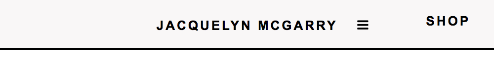
<div class="topnav" id="myTopnav"> <div class="topnav-centered"> <a href="index.html">JACQUELYN MCGARRY</a> </div> <div class="topnav-right"> <a href="shop.html">SHOP</a> <a href="work.html">WORK</a> </div> <a href="about.html">ABOUT</a> <a href="contact.html">CONTACT</a> <a href="javascript:void(0);" class="icon" onclick="myFunction()"><i class="fa fa-bars"></i> </a> </div> <script> function myFunction() { var x = document.getElementById("myTopnav"); if (x.className === "topnav") { x.className += " responsive"; } else { x.className = "topnav"; } } </script> .topnav { position: fixed; top: 0; width: 100%; padding: 0px; } .topnav a { float: left; display: block; text-align: center; padding: 14px 24px 12px 24px; } .topnav a:hover { padding: 12px 22px 10px 22px; } @media screen and (max-width: 600px) { .topnav a{ float: none; display: block; } .topnav-centered a { position: relative; top: 0; left: 0; transform: none; } .topnav-right a{ float: none; position: relative; } } .topnav .icon { display: none; } @media screen and (max-width: 500px) { .topnav a:not(:first-child) {display: none;} .topnav a.icon { float: left; display: block; } } .topnav-centered a { float: none; position: absolute; top: 50%; left: 50%; transform: translate(-50%, -50%); } .topnav-right { float: right; } @media screen and (max-width: 500px) { .topnav.responsive {position: fixed;} .topnav.responsive .icon { position: absolute; right: 0; top: 0; } .topnav.responsive a { float: none; display: block; /* text-align: left;*/ } } My float right menu items don't nest in the hamburger menu. I tried float:left on mobile for topnav-right with no luck. I have no idea how to fix it. Code has been personalized from w3schools tutorials


-
Which method is better to use font on the website? Which can be used for both desktop and mobile. I think it's better to use @font-face. Because the fonts are downloaded on my own website and will come in handy on devices that don't support fonts. I also want feedback from you

-
I have a fixed menu with a centered logo, left and right menu items. My float right menu items are showing beside the hamburger menu on responsive/mobile settings. The menu uses float: right for positioning the hamburger menu and the menu items. <div class="topnav" id="myTopnav"> <div class="topnav-centered"> <a href="index.html">JACQUELYN MCGARRY</a> </div> <div class="topnav-right"> <a href="shop.html">SHOP</a> <a href="work.html">WORK</a> </div> <a href="about.html">ABOUT</a> <a href="contact.html">CONTACT</a> <a href="javascript:void(0);" class="icon" onclick="myFunction()"><i class="fa fa-bars"></i> </a> </div> <script> function myFunction() { var x = document.getElementById("myTopnav"); if (x.className === "topnav") { x.className += " responsive"; } else { x.className = "topnav"; } } </script> .topnav { position: fixed; top: 0; width: 100%; padding: 0px; background-color: #f9f7f7; overflow: hidden; text-transform: uppercase; letter-spacing: 2px; border-bottom-style: solid; border-width: 2px; } .topnav a { float: left; display: block; color: #000000; text-align: center; padding: 14px 24px 12px 24px; text-decoration: none; font-size: 13px; font-weight: 900; font-style: normal; } .topnav a:hover { padding: 12px 22px 10px 22px; border-style: solid; border-width: 2px; border-radius: 50%; color: #101010; } .topnav .icon {display: none;} @media screen and (max-width: 600px) { .topnav a{ float: none; display: block; } .topnav-centered a { position: relative; top: 0; left: 0; transform: none; } } @media screen and (max-width: 600px) { .topnav-right { background-color: red; float: none; } } .topnav-centered a { float: none; position: absolute; top: 50%; left: 50%; transform: translate(-50%, -50%); } .topnav-right { float: right; } @media screen and (max-width: 500px) { .topnav a:not(:first-child) {display: none;} .topnav a.icon { float: left; display: block; } } @media screen and (max-width: 500px) { .topnav.responsive {position: fixed;} .topnav.responsive .icon { position: absolute; right: 0; top: 0; } .topnav.responsive a { float: none; display: block; /* text-align: left;*/ } }

-
I have used this gallery from W3Schools https://www.w3schools.com/howto/howto_js_slideshow_gallery.asp and i want to add function arrow keyboard keys to change pictures in the gallery. Can someone here help me out?
-
 Hi, I'm wondering about advice regarding rotating adverts / messages. Ive not had adverts etc on my site before so this is the first (but I do have rotating one-liner messages in various places using carousel.) https://www.w3schools.com/w3css/w3css_slideshow.asp I am wondering - about creating "one" advert containing 2 words/phrases that rotate in themselves.. But then when a 2nd rotation is complete, The ad changes to a "second" advert which may contain picture or more HTML. example :- A ) Advert one, first screen/message B ) Advert one, second screen/message C ) Advert two, only one screen/text I can probably figure out how to rotate A & B - as individual ads.. but What I'm after is to show A, then B - rotate them a few times "as one ad", and then move onto C. What i'm not after is to show B, then C and back to B again - as 3 separate / distinct ads. has anyone got advice on how to achieve this ? Or even understand how im explaining it ?
 -
Here is the code from w3: <style> .tooltip { position: relative; display: inline-block; border-bottom: 1px dotted black; } .tooltip .tooltiptext { visibility: hidden; width: 500px; background-color: black; color: #fff; text-align: left; border-radius: 6px; padding: 5px 0; /* Position the tooltip */ position: absolute; z-index: 1; top: -5px; left: 0%; } .tooltip:hover .tooltiptext { visibility: visible; } </style> Here it is inside body: <div class="tooltip"> text text text <span class="tooltiptext"> <!-- <span class="tooltiptext" width: 800px;> did not work --> <!-- <style="width; 800px"> tooltip text </style> did not work --> tooltip text </span> </div> I need to set a specific width for each tooltip. I have tried several ways: " . style="width: 800px /. " but it did not work
-
 As the title suggests, the site that I have just finished and delivered, therefore also online, works perfectly on all browsers except safari. I can't understand what the problem is. Do you have any ideas ?? On the home page, the parallax effect "vibrates" tremendously, almost causing nausea. here the link of the page, to understand what I mean, open them with google chrome (fluid and perfect site) and then check with safari. Homepage www.teamcobram.com if it were useful I could also post the code, but you can find it on the site without problems. many thanks in advance
 -
Hello, I would like to be able to insert images of varying width and height into a fixed width and height container on a page such that if they are wider or taller than this container then the over-sized part of the image is simply truncated, without any stretching, but also so that the image fills the full container without leaving any white space ... in other words it will drag the image over the border of width to fill height, or over the border of height to fill width. In other words, the image is placed in the top left corner but fills the entire space without being stretched. So enlarging by proportion and allowing one dimension to stretch over, but the smaller dimension goes to 100% only. This, as opposed to resizing an image to squeeze within a container making the image stretch to fit. Any help would be greatly appreciated! Kind regards, Mike
-
 https://www.w3schools.com/howto/howto_js_collapsible.asp Total noob, have some ideas, but still a bit unsure on the best approach. Was going to implement something similar to what's here (also see supplementary page) http://www.dynamicdrive.com/dynamicindex17/ddaccordion.htm thank-you!
-
Hello! I'm currently working on the error and success pages that will display after you fill out a contact form. I styled for mobile first so there's no media query for that, but there's a media query for desktop at Line 56. For some reason the desktop styles are overriding the mobile ones, when I inspect on google it's not showing the mobile styles at all. Thankful for any help in advance. https://codepen.io/danajcarroll/pen/OJXdmVO
-
Hello everyone, I would be very appreciative to understand how to use the W3C Schools Template so that I can have multiple stored images served depending on the device width. In other words rather than uploading just one image and letting the template resize it going from a widescreen to mobile size, I'd like some control with regards to the centering of each image. Also, I can then optimise the image sizes too to be radically smaller for mobile (do the W3C Schools Templates automatically optimise image size for me, for example a wide screen image may be hard to reduce to under 200 KB to retain quality versus some images on mobile coudl easily be fine at 30 KB). Thanks so much for your help! Kind regards, Mike
-
Which is the best CSS unit relative for a site responsive?
-
Hi there, I am not usually a coder, but I have a Wordpress site with a Mailchimp form that I have been customizing. I want the Submit button to zoom on hover. I've looked at examples of this on the web, but have been unsuccessful in making it work. I have a CSS plugin in which I have entered the following code. So far, it all works. Can anyone tell me how to add the zoom on hover code? /* Add a Border Around the Form*/ #mc_embed_signup { border-color: #000000; border-width: 1px; border-style: solid; } /* Add Padding Around the Mailchimp Form*/ #mc_embed_signup { padding: 20px; } /* Customize the Header*/ #mc_embed_signup h2 { font-size: 24px; text-transform: uppercase; margin-bottom: 30px; color: #000000; text-align: center; } /* Customize the Subscribe Button*/ #mc_embed_signup .subscribe-button { background-color: #0EAD69; padding: 12px 50px; border-radius: 50px; border-color: #738DFF; color: #ffffff; font-size: 16px; display: block; margin-right: auto; margin-left: auto; } /* Change Colour of Subscribe Button on Hover*/ #mc_embed_signup .subscribe-button:hover { background-color: #738DFF; color: #ffffff; display: inline-block; display: block; margin-right: auto; margin-left: auto; } #mc_embed_signup .required-email { color: #A8A3A2; font-style: italic; background-color: #fff; border-color: #000000; } #mc_embed_signup .first-name { color : #A8A3A2; font-style: italic; background-color: #fff; border-color: #000000; margin-bottom: 10px; }
-
Hello guys, I´m currently creating a website and have to use some kind of a switch button (in iOS-Style). I already implemented the switch button, however I want the user to switch with the button between two upcoming photo galleries. Because documentation in the www is lacking, I would need your support. Because I´m pretty unexperienced in website coding, I used the W3school switch button (https://www.w3schools.com/howto/howto_css_switch.asp) I hope you could help and I´m sorry for being such unexperienced but having high demands.
-
The only intended difference between the grid displays in the following are the use of DIV versus PRE tags. I don't understand why there is a large vertical gap between the displays. Not a major problem, just would like to know why the difference or where it is coming from. <!DOCTYPE html><html lang="en"><head> <meta charset="UTF-8"> <meta name="viewport" content="width=device-width,initial-scale=1.0, user-scalable=yes"/> <title>css Simple Grid compare</title> <!-- From: https://medium.com/better-programming/make-a-responsive-grid-with-only-3-lines-of-css-5e2f3837ccc see also: https://css-tricks.com/auto-sizing-columns-css-grid-auto-fill-vs-auto-fit/ see also: https://gridbyexample.com/examples/example37/ see also: https://developer.mozilla.org/en-US/docs/Web/CSS/CSS_Grid_Layout/Auto-placement_in_CSS_Grid_Layout --> <style> .grid { display: grid; /* auto-fill is the same */ grid-template-columns: repeat(auto-fit, minmax(250px, 1fr)); grid-gap: 4px; } .Ditem { border: 1px solid blue; } .Pitem { border: 1px solid blue; white-space: pre-wrap; } </style> </head><body> <h2>Grid - DIV</h2> <div class="grid"> <div class="Ditem">Product 1 <br> This contains a longer number of words within the item. </div> <div class="Ditem">Product 2</div> <div class="Ditem">Product 3</div> <div class="Ditem">Product 4</div> <div class="Ditem">Product 5</div> <div class="Ditem">Product 6</div> <div class="Ditem">Product 7 - no vertical gap!</div> </div> <h2>Grid - PRE</h2> <div class="grid"> <pre class="Pitem">Product A <br> This contains a longer number of words within the item. </pre> <pre class="Pitem">Product B</pre> <pre class="Pitem">Product C</pre> <pre class="Pitem">Product D</pre> <pre class="Ditem">Product E</pre> <pre class="Ditem">Product F</pre> <pre class="Pitem">Product G - why such a large vertical gap?</pre> </div> </body></html>
-
https://cdnjs.cloudflare.com/ajax/libs/font-awesome/4.7.0/css/font-awesome.min.css i am going to make a website. Will it be a problem if i use this css for it. I am asking about copyright issues.
-
On w3schools.com it's suggested use em instead of px because first it's relative and second it's static. I'm still confused; which is the improvement?
-
https://www.w3schools.com/howto/tryit.asp?filename=tryhow_js_slideshow So I basically copied this whole thing but the css and js are externally because my school project requires it to be. When the website loads, it is supposed to display the first image in the slideshow. However, when I loaded it up with everything linked, it is just blank with no image shown. It makes me click one of the dots/one of the arrows to see an image. Can anyone help me fix? gallery.htmlgallery.cssgallery.js
-
Hi guys, If you click on "AC-brytare" there will be som content on the right. I want this content (.tabcontent) to automatically scroll down using position: sticky; How come it does not work? Best, Anders <!DOCTYPE html> <html> <head> <meta name="viewport" content="width=device-width, initial-scale=1"> <style type="text/css">* {box-sizing: border-box} body {font-family: "Lato", sans-serif;} /* Style the tab */ .tab { float: left; border: 1px solid #ccc; background-color: #f1f1f1; width: 40%; height: 100%; } /* Style the buttons inside the tab */ .tab button { display: block; background-color: inherit; color: black; padding: 5px 16px; width: 100%; border: none; outline: none; text-align: left; cursor: pointer; transition: 0.3s; font-size: 80%; } /* Change background color of buttons on hover */ .tab button:hover { background-color: #ddd; } /* Create an active/current "tab button" class */ .tab button.active { background-color: #ccc; } /* Style the tab content */ .tabcontent { float: left; padding: 0px 12px; border: 1px solid #ccc; width: 60%; border-left: none; height: 100%; overflow: hidden; position: sticky; top: 0; } </style> <h2>Solcellslexikon</h2> <div class="tab"><button class="tablinks" id="defaultOpen" onclick="openCity(event, 'AC-brytare')">AC-brytare</button> <button class="tablinks" onclick="openCity(event, 'Ampere')">Ampere (A)</button> <button class="tablinks" onclick="openCity(event, 'Anlaggningsid')">Anläggnings-ID</button> <button class="tablinks" onclick="openCity(event, 'anslutningspunkt')">Anslutningspunkt</button> <button class="tablinks" onclick="openCity(event, 'azimutvinkel')">Azimutvinkel</button> <button class="tablinks" onclick="openCity(event, 'behorigelektriker')">Behörig elektriker</button> <button class="tablinks" onclick="openCity(event, 'belastning')">Belastning</button> <button class="tablinks" onclick="openCity(event, 'cemarkning')">CE-märkning</button> <button class="tablinks" onclick="openCity(event, 'dc')">DC</button> <button class="tablinks" onclick="openCity(event, 'effekt')">Effekt</button> <button class="tablinks" onclick="openCity(event, 'effektbegransning')">Effektbegränsning</button> <button class="tablinks" onclick="openCity(event, 'effektgaranti')">Effektgaranti</button> <button class="tablinks" onclick="openCity(event, 'egenanvandel')">Egenanvänd el</button> <button class="tablinks" onclick="openCity(event, 'elhandelsforetag')">Elhandelsföretag</button> <button class="tablinks" onclick="openCity(event, 'elproducent')">Elproducent</button> <button class="tablinks" onclick="openCity(event, 'elsakerhetsintyg')">Elsäkerhetsintyg</button> <button class="tablinks" onclick="openCity(event, 'falsatplattak')">Falsat plåttak</button> <button class="tablinks" onclick="openCity(event, 'huvudsakring')">Huvudsäkring</button> <button class="tablinks" onclick="openCity(event, 'inverter')">Inverter (växelriktare)</button> <button class="tablinks" onclick="openCity(event, 'jordfelsbrytare')">Jordfelsbrytare</button> <button class="tablinks" onclick="openCity(event, 'kilowatt')">Kilowatt (kW)</button> <button class="tablinks" onclick="openCity(event, 'kilowattimme')">Kilowattimme (kWh)</button> <button class="tablinks" onclick="openCity(event, 'likstrom')">Likström</button> <button class="tablinks" onclick="openCity(event, 'lutningpatak')">Lutning på tak</button> <button class="tablinks" onclick="openCity(event, 'monokristallin')">Monokristallin</button> <button class="tablinks" onclick="openCity(event, 'mppt')">MPPT</button> <button class="tablinks" onclick="openCity(event, 'markeffekt')">Märkeffekt</button> <button class="tablinks" onclick="openCity(event, 'noct')">NOCT</button> <button class="tablinks" onclick="openCity(event, 'natbolag')">Nätbolag</button> <button class="tablinks" onclick="openCity(event, 'optimerare')">Optimerare</button> <button class="tablinks" onclick="openCity(event, 'paneltyp')">Paneltyp</button> <button class="tablinks" onclick="openCity(event, 'pascal')">Pascal (PA)</button> <button class="tablinks" onclick="openCity(event, 'plattaktrapets')">Plåttak trapets</button> <button class="tablinks" onclick="openCity(event, 'plattakfalsat')">Plåttak falsat</button> <button class="tablinks" onclick="openCity(event, 'rails')">Rails</button> <button class="tablinks" onclick="openCity(event, 'rotavdrag')">Rotavdrag</button> <button class="tablinks" onclick="openCity(event, 'servissakring')">Servissäkring</button> <button class="tablinks" onclick="openCity(event, 'snolastberakning')">Snölastberäkning</button> <button class="tablinks" onclick="openCity(event, 'solcell')">Solcell</button> <button class="tablinks" onclick="openCity(event, 'solpanel')">Solpanel</button> <button class="tablinks" onclick="openCity(event, 'spanning')">Spänning (V)</button> <button class="tablinks" onclick="openCity(event, 'stc')">STC</button> <button class="tablinks" onclick="openCity(event, 'strang')">Sträng</button> <button class="tablinks" onclick="openCity(event, 'strom')">Ström</button> <button class="tablinks" onclick="openCity(event, 'tegeltak')">Tegeltak</button> <button class="tablinks" onclick="openCity(event, 'toppeffekt')">Toppeffekt</button> <button class="tablinks" onclick="openCity(event, 'verkningsgrad')">Verkningsgrad</button> <button class="tablinks" onclick="openCity(event, 'vindlastberakning')">Vindlastberäkning</button> <button class="tablinks" onclick="openCity(event, 'volt')">Volt (V)</button> <button class="tablinks" onclick="openCity(event, 'vaxelriktare')">Växelriktare</button> <button class="tablinks" onclick="openCity(event, 'vaxelstrom')">Växelström</button> <button class="tablinks" onclick="openCity(event, 'watt')">Watt (W)</button> <button class="tablinks" onclick="openCity(event, 'overskottsel')">Överskottsel</button> <button class="tablinks" onclick="openCity(event, 'overspannigsskydd')">Överspänningsskydd</button> </div> <div class="tabcontent" id="AC-brytare"> <h3>Vad är en AC-brytare?</h3> <p>AC-brytare krävs för att koppla bort växelriktaren från elnätet vid service och underhåll. Nätbolaget skall alltid ha möjlighet att slå ifrån anläggningen. Brytaren placeras bredvid eller i närheten av växelriktaren för att göra det enklare att frånskilja växelriktaren. </p> <script>function openCity(evt, cityName) { var i, tabcontent, tablinks; tabcontent = document.getElementsByClassName("tabcontent"); for (i = 0; i < tabcontent.length; i++) { tabcontent[i].style.display = "none"; } tablinks = document.getElementsByClassName("tablinks"); for (i = 0; i < tablinks.length; i++) { tablinks[i].className = tablinks[i].className.replace(" active", ""); } document.getElementById(cityName).style.display = "block"; evt.currentTarget.className += " active"; } // Get the element with id="defaultOpen" and click on it document.getElementById("defaultOpen").click();</script> </body> </html>
-
I have a CSS style that creates a TOP button fixed to the bottom right of a web page so, as you scroll, it stays put. How can I detect when the browser window is maximized so as to keep the Top button on the lower right edge of the content? My page design uses an 850px wide whole page table for content so the page width is fixed whether the browser window is at 850px or maximized. This is how a Word or PDF document behaves. The Top button appears at the lower right of the window at 850px but at the center of the page when the browser is maximized. The basic properties position the Top button to the left and slightly above the bottom of the window. position: fixed; bottom: 85px; left: 800px; with other properties specifying font properties and border effects. Yours, Michael F
-
I am looking for either in css a way to take data from the device used to input as an attribute or a way to combine css and javascript to do the same thing. there may be a variable in css now but it isn't a true variable as far as I have found so far in the tutorial and the info I want I have only seen accessed using javascript so wanted to try combining it with the css I already have. I am looking to basically create a title page with css at the top of a website or in my case an actual ebook. I have this most of the way done. I want it to survive multiple devices so I want a variable height and width and I found that but the height is not quite perfect yet. I am using 100vh for 100% viewport height meaning the entire screen height but what I really want is the full window height. there is a javascript function in the tutorial that gives you the window.innerheight but I don't know how to input that number into my height attribute. right now that 100vh height is making it so that the footer is just beyond the screen and I have to scroll down a little to see it. but what I want it to do is that there is no scrolling needed because it fits perfectly on the screen. here is the code as is. <html> <head> <title>Title Page Template</title> <style> .title { display: flex; position: absolute; height: 100vh; width: 100vw; flex-direction: column; align-items: center; justify-content: center; z-index: -1; } .title > div { width: 100%; margin: 10px; text-align: center; } .copy { display: flex; height: 100vh; width: 100vw; align-items: flex-end; justify-content: center; } .copy > div { width: 100%; text-align: center; } p.large { font-weight: bold; margin-top:1em; font-size: 200%; text-indent: 0em; text-align:center; } p.medium { margin-top:1em; font-weight: bold; font-size: 150%; margin-top:1.0em; text-indent: 0em; text-align:center; } p.small { font-weight: bold; margin-top:1em; font-size: 125%; text-indent: 0em; text-align:center; } </style> </head> <body> <div class="title"> <div><p class="large" id="start">Title</p></div> <div><p class="medium">The Sub-title</p></div> <div><p class="small">By <i>Author</i></p></div> </div> <div class="copy"> <div><p class="small">Publisher © 2019</p></div> </div> </body> </html> and here is the javascript code I found that gets the info I want <html> <body> <p>Click the button to display this frame's height and width.</p> <button onclick="myFunction()">Try it</button> <p><strong>Note:</strong> The innerWidth and innerHeight properties are not supported in IE8 and earlier.</p> <p id="demo"></p> <script> function myFunction() { var w = window.innerWidth; var h = window.innerHeight; document.getElementById("demo").innerHTML = "Width: " + w + "<br>Height: " + h; } </script> </body> </html> is there a way to get the innerheight and innerwidth into my css to finish this title page design?
-
Hello everyone I am doing an IOT project in which is am successfull to send my microcontroller data to MySQL. I am receiving data in 0 and 1. Now what i want to do? I just to create a toggle switch that will ON when data in database is 1 and when data is 0 it remains OFF. secondly when i click the switch it should OFF in case it is already ON and a data 0 should be sended to database. same in case of OFF to ON. Please help me You can also use Javascript.

-
So my mom blogs on a norwegian blog site. She got loads of readers there, and wanted to make a website. I finished the website and was quite proud, but there was one problem... I had to automaticcly add her blog post to the website. So everytime she uploads a new post, I have to go into the codes and put it in manually.. Is there a way to do this automaticcly? I have coded the website with HTML and CSS. Any help would be appreaciated!!
-
Hi, every body I have some problem with css align item in flexbox. Like bellow images. Can anyone help me? i will happy to have your answers. thank you


