Search the Community
Showing results for tags 'layout'.
Found 15 results
-
Hello, I appreciate nice html5 layout examples, e.g. https://www.w3schools.com/html/html_layout.asp (source code with new html tags like header, section, nav and others: https://www.w3schools.com/html/tryit.asp?filename=tryhtml_layout_float ), but in many examples in css section are still old div tags with classes like .header and so on, e.g. here: https://www.w3schools.com/css/css_website_layout.asp or here https://www.w3schools.com/howto/howto_css_style_header.asp . I think this could be change to newer html5 code, for example this code with divs: https://www.w3schools.com/css/tryit.asp?filename=trycss_website_layout_grid to code in attachment, which is easier (I hope :-) css-layout.html
-
I'm trying to give to my nav and my aside tags 70% height but it doesn't work. Please help me, it's beeing very difficult for me layingout my page, i don't even know how to layout pictures can someone give a hint, or a place where i can read it. THANK YOU VERY MUCH. I ATACH MY CSS AND HTML FILES. style.css index.html
-
Hi all, I have started using W3.CSS and it is really impressing. I would like to arrange the last column of a table as a row at the end of that table but I can't find the way. Any help? Thanks
-
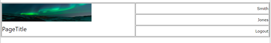
Hello... I am trying to design a sticky header bar for my project. While I have already got the sticky bar working, I am now trying to create a better layout of the content on the bar using CSS (w3.css or standard css). I cannot figure out how to achieve this. Any suggestions? What I would like to have (w/out the borders) is: <table style="width:100%"> <tr> <td rowspan="3" width="50%"> <img src="img_lights.jpg" style="height:70px;width:350px" alt="logo_plc_holder"> <h3>PageTitle</h3> </td> <td align="right"> Smith </td> </tr> <tr> <td align="right"> Jones </td> </tr> <tr> <td align="right"> Logout </td> </tr> </table> what I have got so far... (but is not working as intended)... <div class="w3-row "> <div class="w3-half"> <img src="img_lights.jpg" style="height:70px;width:350px" alt="logo_plc_holder"><br /><h3>PageTitle</h3> </div> <div class="w3-half"> <div class="w3-row" style="float:right;"> Smith </div> <div class="w3-row" style="float:right;"> Jones </div> <div class="w3-row" style="float:right;"> Logout </div> </div> </div>


-
Hey guys, i want to include a forum on my website. How can i do this? And maybe there is a way to make a template for this in w3, too? Hope for reply: David
-
As you can see by the screenshot I have an unwanted horizontal scroll bar. The styles are below: #container { width: 100%; background: #fff; margin-top: 0; margin-right: auto; margin-bottom: 0; margin-left: auto; } #header { background: #fff; padding: 20px; height: 1%; } .header_right { background-color: #fff; float: right; height: 2%; display: inline; margin-bottom: 0px; } #header h1 { margin: 0; } #navigation { float: left; width: 100%; background: #333; } #navigation ul { margin: 0; padding: 0; } #navigation ul li { list-style-type: none; display: inline; } #navigation li a { display: block; float: left; padding: 5px 10px; color: #fff; text-decoration: none; border-right: 1px solid #fff; } #navigation li a:hover { background: #383; } #topspace { clear: both; background:#fff; text-align: right; padding: 10px; height: .25%; } #bottomspace { clear: both; background:#fff; text-align: left; padding: 10px; height: 0.15%; } /*Flyout CSS menu */ #flyout_menu { font-weight: 600; width: 200px; float: left; } #flyout_menu ul, li { list-style: none; margin: 0; padding: 0; } #flyout_menu ul li.hover, #flyout_menu ul li:hover { position: relative; z-index: 599; } #flyout_menu ul ul{ visibility: hidden; position: absolute; top: 100%; left: 0; z-index: 598; } #flyout_menu ul li:hover > ul { visibility: visible; } #flyout_menu ul ul { top: 0; left: 100%; } #flyout_menu span, #flyout_menu a { display: inline-block; font-family: Arial, Helvetica, sans-serif; font-size: 12px; text-decoration: none; } #flyout_menu li { background-color: #333333; } #flyout_menu li:hover, #flyout_menu li.active { background-color: #666666; } #flyout_menu a { color: #FFF; line-height: 160%; padding: 16px 8px 16px 28px; width: 164px; } #flyout_menu ul ul li { background: #006C6C; border-bottom: 1px solid #007171; } #flyout_menu ul ul li:hover { background-color: #999999; } /* end of flyout menu */ #content-container1 { float: left; width: 100%; background: #fff url(/wp-content/uploads/layout-three-liquid-background1.gif) repeat-y 20% 0; } #content-container2 { float: left; width: 100%; background: url(/wp-content/uploads/layout-three-liquid-background2.gif) repeat-y 80% 0; } #section-navigation { float: left; width: 16%; padding: 20px 0; margin: 0 2%; display: inline; } #section-navigation ul { margin: 0; padding: 0; } #section-navigation ul li { margin: 0 0 1em; padding: 0; list-style-type: none; } #content { float: right; width: 56%; margin-top: 0; margin-right: 0; margin-bottom: 0; margin-left: 0%; padding-top: 20px; padding-right: 25%; padding-bottom: 20px; padding-left: 0%; } #content h2 { margin: 0; font-family: Verdana, Arial, Helvetica, sans-serif; text-align: center; color: #000066; } #aside { float: right; width: 16%; padding: 20px 0; margin: 0 2% 0 0; display: inline; } #aside h3 { margin: 0; } #footer { clear: both; background: #333; text-align: right; padding: 7px; height: 1%; color: #FFFFFF; } .video { background-color: #0066CC; text-align: center; } p { font-family: Verdana, Arial, Helvetica, sans-serif; font-size: 100%; font-style: normal; line-height: 1.25em; font-weight: normal; } Thank you in advance

-
Hi, Having a few problems with something that should be dead simple. See image Firstly I need some space between the horizontal and vertical menus.[1] Secondly the menu isn't picking up the styles at all? Thirdly I cannot get the content div to sit next to the flyout_menu Here is the CSS: #container { margin: 0 auto; width: 100%; background: #fff; } #header { background: #ccc; padding: 20px; height: 80px; } .header_right { background-color: #00CCCC; float: right; height: 100px; display: inline; margin-bottom: 0px; } #header h1 { margin: 0; } #navigation { float: left; width: 100%; background: #333; } #navigation ul { margin: 0; padding: 0; } #navigation ul li { list-style-type: none; display: inline; } #navigation li a { display: block; float: left; padding: 5px 10px; color: #fff; text-decoration: none; border-right: 1px solid #fff; } #navigation li a:hover { background: #383; } #topspace { display: block; float: left; padding: 5px 10px; color: #fff; } /* flyout menu styles */ #flyout_menu { font-weight: 600; width: 200px; } #flyout_menu ul, li { list-style: none; margin: 0; padding: 0; } #flyout_menu ul li.hover, #flyout_menu ul li:hover { position: relative; z-index: 599; } #flyout_menu ul ul{ visibility: hidden; position: absolute; top: 100%; left: 0; z-index: 598; } #flyout_menu ul li:hover > ul { visibility: visible; } #flyout_menu ul ul { top: 0; left: 100%; } #flyout_menu span, #flyout_menu a { display: inline-block; font-family: Arial, Helvetica, sans-serif; font-size: 12px; text-decoration: none; } #flyout_menu li { background: #005555; } #flyout_menu li:hover, #flyout_menu li.active { background: #5FD367; } #flyout_menu a { color: #FFF; line-height: 160%; padding: 16px 8px 16px 28px; width: 164px; } #flyout_menu ul ul li { background: #006C6C; border-bottom: 1px solid #007171; } #flyout_menu ul ul li:hover { background: #5FD367; } #content-container1 { float: left; width: 100%; background: #fff url(/wp-content/uploads/layout-three-liquid-background1.gif) repeat-y 20% 0; } #content-container2 { float: left; width: 100%; background: url(/wp-content/uploads/layout-three-liquid-background2.gif) repeat-y 80% 0; } #section-navigation { float: left; width: 16%; padding: 20px 0; margin: 0 2%; display: inline; } #section-navigation ul { margin: 0; padding: 0; } #section-navigation ul li { margin: 0 0 1em; padding: 0; list-style-type: none; } #content { float: right; width: 56%; margin-top: 0; margin-right: 0; margin-bottom: 0; margin-left: 0%; padding-top: 20px; padding-right: 25%; padding-bottom: 20px; padding-left: 0%; } #content h2 { margin: 0; } #aside { float: right; width: 16%; padding: 20px 0; margin: 0 2% 0 0; display: inline; } #aside h3 { margin: 0; } #footer { clear: both; background: #ccc; text-align: right; padding: 20px; height: 1%; } Here is the HTML: <!DOCTYPE HTML PUBLIC "-//W3C//DTD HTML 4.01//EN" "http://www.w3.org/TR/html4/strict.dtd"> <html> <head> <title>Yr8 CSS & HTML </title> <meta http-equiv="Content-Type" content="text/html; charset=iso-8859-1" > <link rel="stylesheet" type="text/css" href="styles.css" > </head> <body> <div id="container"> <div id="header"> <div class="header_right"><img src="imagesAudi_RS4.jpg" alt="audi R8" width="200" height="100"></div> <h1>Put your site name here</h1> </div> <div id="navigation"> <ul> <li><a href="#">Home</a></li> <li><a href="#">About</a></li> <li><a href="#">Services</a></li> <li><a href="#">Contact us</a></li> </ul> </div> <div id="content-container1"> <div id="content-container2"> <div id='flyout_menu'> <ul> <li><a href='#'><span>Link 1</span></a></li> <li><a href='#'><span>Link 2</span></a> <ul> <li><a href='#'><span>Product 1</span></a> <ul> <li><a href='#'><span>Sub Product</span></a></li> <li><a href='#'><span>Sub Product</span></a></li> </ul> </li> <li><a href='#'><span>Product 2</span></a> <ul> <li><a href='#'><span>Sub Product</span></a></li> <li><a href='#'><span>Sub Product</span></a></li> </ul> </li> </ul> </li> <li><a href='#'><span>Link 3</span></a></li> <li><a href='#'><span>Link 4</span></a></li> </ul> </div> <div id="content"> <h2> Page heading </h2> <p> </p> </div> <div id="aside"> <h3> Aside heading </h3> <p> </p> </div> <div id="footer"> Copyright © Site name, 20XX </div> </div> </div> </div> </body> </html> Any help gratefully received.

-
Hello everyone, I am facing an issue with a page containing a table and a form : the form does not take over the style defined in the style sheet. It work out fine once I omit the closing </table>, however in that case the order of the elements gets messed up. What can I do to fix this ? Here is the code (I've taken out several irrelevant elements (additional list items, metas, etc.) : <!DOCTYPE html> <html> <head> <meta charset="iso-8859-1" /> <title>HIGHWAY - Hard Rock'n'Roll</title> <link rel="Shortcut icon" href="favicon2.ico" type="image/x-icon"> <link rel="stylesheet" type="text/css" media="screen" href="styles.css"> <style> ul {list-style-type: none; margin: 0; padding: 0;} li {display: inline;} </style> </head> <body style="background-color:#000"> <center> <img src="logo_entete.jpg" alt="Logo Highway" style="width:700px; height:196px;"><br/> <br/> <br/> <!-- Site navigation menu --> <nav> <ul> <li><a href="news_fr.html">★ NEWS</a></li> <li><a href="band_fr.html">★ BAND</a></li> </ul> </nav> <br/> <!-- Main content --> <h1 style="text-align:left">CONTACT</h1> </br> <table> <tr> <td><u>Booking (France)</u><br/><br/> HIGHWAY Corp.<br/> 128 Place du Quebec, Appt 36<br/> 34000 Montpellier - France<br/> Email : highwaybeer@hotmail.com<br/> Téléphone : +33 6 29 37 93 57 </td> <td><u>Booking international (hors France)</u><br/><br/> Big Noise Productions<br/> Christina Guntert<br/> Email : ca.guntert@hotmail.fr<br/> Téléphone : +33 6 43 58 53 29<br/> </br> </td> <td><u>Technicien son</u><br/><br/> Adrien Lagarde<br/> Email : lagarde.music@gmail.com<br/> Téléphone : +33 6 48 55 29 59<br/> </br> </br> </td> </table> <p class="section_form" align="left"> <form action="MAILTO:ca.guntert@hotmail.fr" method="post" enctype="text/plain"> Abonnez-vous à la newsletter : <input type=text name:mail value="Votre adresse email"> <input type="submit" value="S'abonner"> </form> </p> <br/> <!-- Footer --> <p class="footer">© Highway Corp. 2014</p> </body> </html>
-
I want to overlap one div on another using css as shown in image below and i have following html and code <div id="div1">This is div 1</div><div id="div2">This is div 2</div> div1{width:800x;height:200px;background-color:#292929;color:#FFFFFF;}div2{width:800x;height:50px;background-color:#333333;color:#FFFFFF;} I want my footer to be like the image shown below, how can i do it ? I have uploaded the image, but if you are enable to see it then you can view the image easily at this URL http://imageart.webs.com/footer.png
-
How come when I use Position Fixed or Absolute, the element says relative to where it is placed until I specify top, down, left or right. <style> #paragraph { position:absolute; }</style><p>1</p><p id="paragraph" >2</p><p>3</p><p>4</p><p>5</p>
-
I have an app for scheduling for out homeschooling. I use floating divs to represent various events in a column for each child and for each day. I found that I can set the height of each div such that one hour is 5.55% of the total height of the containing div. style="height:5.55%;" So I thought to represent the time between events using margin-top. So 30 minutes of free time could be represented this way: style="height:5.55%;margin-top:2.78%" But margin-top is calculated based on the width of the element. I was surprised by this inconsistency. The logic which determines that an element's height should be calculated based on the height of the containing element should also be applied to margin-top. Does this make sense? And how would one propose a change to the calculation of margin-top based on percent? Can it even be changed?

-
Hello, a complete beginner here - I have just built my first website, but to my horror I realized that if I view it with another screen resolution, or on someone else's computer, it changes the whole appearance of the site, esp. the flow of the paragraphs, often to a very ugly result. Images start to overlap paragraph, and paragraphs suddenly look extremely narrow. I am happy to restructure the website, (built in html without Dreamweaver's help) but have no idea how - especially how to make the main structure adjust to different views (larger/smaller screens, i-pads etc) Thank you! You can view the website and its source here - http://www.aidanandrewdun.com/ I'd be grateful if you viewed the page source and let me know what I've been doing wrong.
-
Hi everybody.Long-time fanFirst-time poster. I recently took over my parents' business' website. It was originally developed by some guy, and it looks ok now and gets the job done. However, I'd like to modernize the site a little bit, but I'm having trouble figuring some things out. The current site is at http://renovax4u.comThe .jpeg of what I'd like the site to look like is at http://renovax4u.com/images/Misc./newrenovaxsite.jpg I'm primarily having trouble figuring out how to change the layout colors and format so that I can edit the site to look like what I want it to. Any and all help on how I can do this, is greatly appreciated...
-
So im here again, with another problem now. Look at the site http://mbdbygg.zxq.net/. The grey area in the middle is a div id called content and it is 800px height. Now i want to reduce the height to 400px, cause i dont need such wide space between the pictures and the footer as you see. The content div should end where the div class "center" ends. It has a border color to see where it ends. The problem now is that when i change the height to 400px the box only goes upand leaving a WHITE space under it.Meaning the footer does not follow up to the content div! What am i missing? I attach the css: *{ margin: 0px; padding: 0px;}body { margin-left: 0px; margin-top: 0px;}img { border: none;}#wrapper { min-width: 1347px; border: 1px solid #727272;font-family:Verdana, Arial, Helvetica, sans-serif;color:#cccccc;}#header { height: 180px;background-color:#FFFFFF;background-repeat:repeat-x;background-image:url(mbdbygg.gif);background-position:center;background-repeat:no-repeat;} #content { height: 800px;background-color:#2A2727;background-repeat:repeat-x;}.lefttext {position:relative;float:left;top:50px;left:40px;width:250px;height:400px;border: 1px solid #727272;}.righttext {position:relative;float:right;top:50px;right:40px;width:250px;height:400px;border: 1px solid #727272;}#center {position:relative;top:50px;left:297px;width:750px;height:500px;border: 1px solid #727272;}.meny {position:relative;font-family:Verdana, Arial, Helvetica, sans-serif;left:73px; top:12px;float:left;}.meny li{ display:inline; }.meny ul li a{ text-decoration: underline; color:#cccccc; font-weight: bold; }.meny ul li a:hover{ text-decoration: none; } .bilder { position:relative; float:left; left:1px; top:-360px; } .bilder img{ display: inline; border: 1px solid #7F7D7D; } .thumbnail { width:170px; height:130px; margin:5px; }#footer {background-color:#2A2727;background-repeat:repeat-x;border-top: 1px solid #727272;margin:0 auto; height: 60px; clear: both;}div#footer p {font-size:0.6em;font-family:Verdana, Arial, Helvetica, sans-serif;text-align:center;margin:0;padding:25px;}
-
Hi,Am having a little trouble creating 2 divs so they are side by side inside a container with set width. The HTML looks like this:<div id="contenttop"></div><div id="contentmiddle"><div class="set-size"><div class="column-580 float-left">sfhsfhs</div><div class="column-400 float-right">sfhsfh</div></div></div><div id="contentbottom"></div> and the CSS is as follows/*<-- column system settings -->*/.set-size {width:980px;margin:0 auto;}.column-580 {width:580px;}.column-400 {width:400px;}/*<-- content -->*/#contenttop { background: url(../images/content_top.png) no-repeat; width: 980px; height: 30px; margin-top:9px;}#contentmiddle { background: url(../images/content_middle.png) repeat-y;}#contentbottom { background: url(../images/content_bottom.png) no-repeat; width:980px; height:30px;} however for some reason the divs dont seem to go side by side, but undernaeah each other. Basically, i want to have one div on the left hand side with some content (the 580px size div) and the other div with content on the right hand side (the 400px size div) Have inserted a picture of how it looks within dreamweaver and you can see the divs are not side-by-side, but go underneath each other. Any help would be greatly appreciated. Regards,James