Search the Community
Showing results for tags 'W3.CSS'.
-
 I've decided to share my post from the JavaScript forum here in case this is the more appropriate place. It's involving MODALS with Bootstrap & JQuery and my question is below. Thank you.
 -
I'm glad to announce the release of w3-ddmenu version 1.0. What is it?. It's a drilldown menu fully compatible with w3.css, with an easy setting and very light. For more details, you can visit http://github.com/lamuzzachiodi/w3-ddmenu. I hope it is useful to the w3.css community. Saludos, Alejandro
-
Good evening, How can I apply the W3.css stylesheet/lib to a specific and only section in an HTML page, like a div? What is the best approach? I ask because loading the CSS file messes with the formatting of some pages completely. Thank you. Kepler
-
Hello Everyone Good Evening I'm following your w3.css tutorial but I need your help. My questions are: - How do I centralize the Work Experience, Education and Skills sections in the middle of the browser window? - How do you fix datetime on the same level as the timebar, ie on the same line as the timebar? I would appreciate your support, please. https://codepen.io/Quencyjones79/pen/eYRWgOm
-
Noob here. I have been playing around with W3.css, in particular the w3-row-padding, however I would like to set up five columns, with some padding. Can anyone advise me how I might go about this (I'm guessing it will involve nesting some containers?) Many thanks.
-
First of all, I am sooo new at this and if I am to learn I need to understand why things behave the way they do. I am using W3.css only in this test (copying a little here and a little there) and my problem is that when looking at it in the browser, the grey box with CAPITALS (the first div) is covering up the first div in sections, the title London does not show. 1, Why? It must have something to do with w3-top because if I delete that, the CAPITALS will not cover London. But of course it is no longer stuck to the top. 2, What is the solution? I added an empty div (<div class="w3-container w3-padding-32"> </div>) right under the CAPITALS and it works but it feels like "cheating". I assume it can be fixed with a css as well. What would be the "proper way" to fix it? And how? Thanks! <!DOCTYPE html> <html> <head> <meta charset="utf-8"> <title>Test</title> <meta name="viewport" content="width=device-width, initial-scale=1"> <link rel="stylesheet" href="https://www.w3schools.com/w3css/4/w3.css"> <link rel="stylesheet" href="https://stackpath.bootstrapcdn.com/font-awesome/4.7.0/css/font-awesome.min.css"> </head> <body> <!-- TOP --> <div class="w3-top"> <div class="w3-container w3-grey"> <h2>CAPITALS</h2> </div> </div> <!-- SECTIONS --> <section> <div class="w3-container w3-light-blue w3-left-align"> <h2>London</h2> <p>London is the most populous city in the United Kingdom, with a metropolitan area of over 9 million inhabitants.</p> </div> <div class="w3-container w3-blue w3-center"> <h2>Paris</h2> <p>The Paris area is one of the largest population centers in Europe, with more than 2 million inhabitants.</p> </div> <div class="w3-container w3-indigo w3-right-align"> <h2>Tokyo</h2> <p>Tokyo is the center of the Greater Tokyo Area, and the most populous metropolitan area in the world.</p> </div> </section> <!-- FOOTER --> <footer class="w3-container w3-deep-purple w3-center"> <p>Footer © 2019</p> </footer> </body> </html>
-
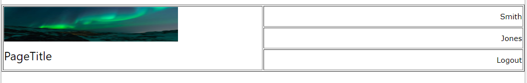
Hello... I am trying to design a sticky header bar for my project. While I have already got the sticky bar working, I am now trying to create a better layout of the content on the bar using CSS (w3.css or standard css). I cannot figure out how to achieve this. Any suggestions? What I would like to have (w/out the borders) is: <table style="width:100%"> <tr> <td rowspan="3" width="50%"> <img src="img_lights.jpg" style="height:70px;width:350px" alt="logo_plc_holder"> <h3>PageTitle</h3> </td> <td align="right"> Smith </td> </tr> <tr> <td align="right"> Jones </td> </tr> <tr> <td align="right"> Logout </td> </tr> </table> what I have got so far... (but is not working as intended)... <div class="w3-row "> <div class="w3-half"> <img src="img_lights.jpg" style="height:70px;width:350px" alt="logo_plc_holder"><br /><h3>PageTitle</h3> </div> <div class="w3-half"> <div class="w3-row" style="float:right;"> Smith </div> <div class="w3-row" style="float:right;"> Jones </div> <div class="w3-row" style="float:right;"> Logout </div> </div> </div>


-
 I believe it's a pretty common observation that the w3-top class of w3.css works by hiding the page below. It seems to me that the default solution is to add some <br> , or setting a margin on the top of the page. That's good enough for layout, but that doesn't help if you use bookmarks with id: when you follow a link from an element with <a href="#example">, this will show the <div id="example"> on the very top of the page, where it will be covered by the w3-top class. I know it's a bit silly and not a huge problem but I'd like the user to get to read the bookmark without scrolling the w3-top class out of the way. Does anybody have any idea on how to solve it? Is there a way to set the bookmark a little higher (to a set height for every instance) on the page? Am using this to write an article with a list of references at the bottom.
 -
I downloaded the latest w3.css framework and updated the css for html, body to use a different font-family. html,body{font-family:'Lato','Open Sans',font-weight:300;sans-serif;font-size:15px;line-height:1.5}html{overflow-x:hidden} However when I did that the font that is now displayed when I use the following code displays an incorrect (and serif) font. <div class="w3-container w3-panel w3-card-2 w3-blue"> <b>System Alert:</b> <br /> System currently in <em>Development Mode</em> </div> What gives? How can I get this to resolve.
-
I have been going through the w3.css documentation and see many things I like. However, the tooltip https://www.w3schools.com/w3css/w3css_tooltips.asp page is different from what I expected. To me, a tooltip is as described on https://en.wikipedia.org/wiki/Tooltip - when you hover over (mouse over) an item a bubble appears with some text in it. Even when writing this post, there is a tooltip saying "Enter your text". But when I hover over "is the capital" in the w3.css tooltip "London is the capital" example, the text "(9 million inhabitants)" instead pushes the following text to the right to occupy some space. It is that "push to the right" part that I do not understand. I am using google chrome 74 and IE 11, both do the same thing. Is there another w3.css class that makes the tooltip with the bubble where the text is not shifted? Any help appreciated.
-
How popular is w3.css framework currently? In other words, about what percent of websites use it? w3.css seems good, and I like w3schools a lot. Thanks
-
 Is It Safe To Use W3.CSS Together With Bootstrap Without Any Conflicts?
 -
I just started using w3.css. I noted that in a summary/details block the arrow to click open or close is not shown any more. By inspecting the w3.css file, I discovered that the statement "summary {display: block;}" causes the disappearance. As work-around I removed it, without visible side-effect. My question: is there an alternative way to get an arrow in w3.css?
-
hi there... i use the dot slideshow indicator with the carousel code for automatic advance images, but can´t make points changes togheter with the image changes with the code... any ideas? sorry about my english.... here is the code... thanks in advance. <header class="w3-display-container w3-center" id="home" style="padding-top: 150px"> <div class="w3-content w3-display-container" style="max-width:800px"> <img class="mySlides" src="img-1.jpg" style="width:100%"> <img class="mySlides" src="img-2.jpg" style="width:100%"> <img class="mySlides" src="img-3.jpg" style="width:100%"> <img class="mySlides" src="img-4.jpg" style="width:100%"> <div class="w3-center w3-container w3-section w3-large w3-text-white w3-display-bottommiddle" style="width:100%"> <div class="w3-left w3-hover-text-khaki" onclick="plusDivs(-1)">❮</div> <div class="w3-right w3-hover-text-khaki" onclick="plusDivs(1)">❯</div> <span class="w3-badge demo w3-border w3-transparent w3-hover-white" onclick="currentDiv(1)"></span> <span class="w3-badge demo w3-border w3-transparent w3-hover-white" onclick="currentDiv(2)"></span> <span class="w3-badge demo w3-border w3-transparent w3-hover-white" onclick="currentDiv(3)"></span> <span class="w3-badge demo w3-border w3-transparent w3-hover-white" onclick="currentDiv(4)"></span> </div> </div> </header> <script> //slideshow carousel var myIndex = 0; carousel(); function carousel() { var i; var x = document.getElementsByClassName("mySlides"); for (i = 0; i < x.length; i++) { x[i].style.display = "none"; } myIndex++; if (myIndex > x.length) {myIndex = 1} x[myIndex-1].style.display = "block"; setTimeout(carousel, 9000); } //new code var slideIndex = 1; showDivs(slideIndex); function plusDivs(n) { showDivs(slideIndex += n); } function currentDiv(n) { showDivs(slideIndex = n); } function showDivs(n) { var i; var n = document.getElementsByClassName("myIndex");//quitar var x = document.getElementsByClassName("mySlides"); var dots = document.getElementsByClassName("demo"); if (n > x.length) {slideIndex = 1} if (n < 1) {slideIndex = x.length} for (i = 0; i < x.length; i++) { x[i].style.display = "none"; } for (i = 0; i < dots.length; i++) { dots[i].className = dots[i].className.replace(" w3-white", ""); } x[slideIndex-1].style.display = "block"; dots[slideIndex-1].className += " w3-white"; } </script>
-
 Hello everybody, I was playing with a template from the w3.css templates from w3 schools and found an issue that I can't get around. In the template called Parralax template or the forth one from top, with the man with grey hat, I saw that the home screen image was loaded from the css .bgimg-1{ min-height: 100%; background-image: url(/w3images/parallax1.jpg); } (from the style brackets after the head tag ) I wanted to do a transition between two images but only found examples on the web that it is possible only when the image is loaded from an html image tag, so I removed the "background-image" from the above css code and added an <img src="/w3images/parallax1.jpg"> tag under the div where the class name was bgimg-1: <!-- First Parallax Image with Logo Text --> <div class="bgimg-1 w3-display-container w3-opacity-min" id="home"> <img src="/w3images/parallax1.jpg"> <div class="w3-display-middle" style="white-space:nowrap;"> <span class="w3-center w3-padding-large w3-black w3-xlarge w3-wide w3-animate-opacity">MY <span class="w3-hide-small">WEBSITE</span> LOGO</span> </div> </div> However, the image now has an empty white space from it's right side and I can't make it full. Does anybody know how to fix that?
 -
Hi, I searched the forums but haven't found an answer about this. I have created a simple eBay template based on w3.css inline style sheet. When I paste into the eBay form it passes checks and the mobile test also works. When I publish the advert, however, the images in Chrome, IE, Firefox (latest versions) all are fixed at original size. If I browse from my mobile phone, however, the resizing works well and appears as intended. Any idea why it doesn't work on desktop browsers? Advert is here: https://www.ebay.co.uk/itm/202385270343 and the template I created: <!DOCTYPE html> <html> <title>Keith eBay Template 2018</title> <meta name="viewport" content="width=device-width, initial-scale=1"> <link rel="stylesheet" href="https://www.w3schools.com/w3css/4/w3.css"> <link rel="stylesheet" href="https://fonts.googleapis.com/css?family=Raleway"> <style> body,p,a,h1,h2,h3,h4,h5 {font-family: "Raleway", sans-serif} </style> <body> <div class="w3-container w3-light-green"> <h2>Harry Potter and the Philosopher's Stone</h2> <h4>Ted Smart First Edition, Hardback, 3rd Print</h4> <div class="w3-panel w3-round-large w3-khaki"> <h3>Description</h3> <p>This is an auction for my Harry Potter and the Philosopher's Stone Ted Smart First Edition. It is a 3rd Print as you can see from the inside cover. These are still highly sought after and I'm sure will continue to gain value over time!</p> <p>This edition has lived for at least 10 years in a box in a cool dry cupboard, and prior to that on a shelf in the shade so the cover hasn't faded at all. There is a little wear that can be seen to the top edge of the sleeve but there are no marks on or in the book itself.</p> <p>How do you identify which edition and print run? I found the following link helpful:</p> <p></p> <a href="https://www.peterharrington.co.uk/blog/is-my-harry-potter-book-valuable-2/" target=_blank">Peter Harrington - Is my Harry Potter Book Valuable</a> </p> </div> <div class="w3-panel w3-round-large w3-khaki"> <h3>Shipping</h3> <p>I will ship this item using the Hermes ParcelShop service. If you would like me to use an alternate courier please contact me. </div> <div class="w3-panel w3-round-large w3-khaki"> <h3>Photographs</h3> <img class="w3-image w3-round-large" src="https://image.ibb.co/gFRCJo/IMG_2036.jpg" style="width:100%"> <img class="w3-image w3-round-large" src="https://image.ibb.co/jn5sjT/IMG_2041.jpg" style="width:100%"> <img class="w3-image w3-round-large" src="https://image.ibb.co/iGJWB8/IMG_2037.jpg" style="width:100%"> <img class="w3-image w3-round-large" src="https://image.ibb.co/cBfiPT/IMG_2039.jpg" style="width:100%"> <img class="w3-image w3-round-large" src="https://image.ibb.co/kzuk4T/IMG_2038.jpg" style="width:100%"> </div> </div> </body> </html>
-
When you add a form that is modal and view on a mobile device (apple mostly) the background still scrolls with your finger. This creates a problem as the form fields (Inputs) do not line up and it almost impossible to edit or add text to input fields as you cannot select them. To reproduce just run the modal login example on your mobile phone and move your finger then try to add text to the input fields - !
-
Hi everyone, I borrowed part of the Marketing / Website Template (W3.CSS), specifically the <!-- Work Row --> portion. It looks fantastic, but according to the device browser, (specifically phones and tablets) when in "landscape" mode, the "w3-card" divs have different height according to the text. I've been trying for days to find a solution - flexbox, w3-cell, pseudo-elements - mostly way above my understanding, and nothing has worked so far. Wouldn't be surprising if I've found a valid solution and mucked it up because of my inexperience Anyway, here's the code from the template. Maybe delete <p>Blablabla</p> from one one of the divs inside the cards to see the issue. Actually the length of text I have inside those divs results in the cards showing the same height down to 1440px, any smaller results in the cards showing unequal height. <!-- Work Row --> <div class="w3-row-padding w3-padding-64 w3-theme-l1" id="work"> <div class="w3-quarter"> <h2>Our Work</h2> <p>Lorem ipsum dolor sit amet, consectetur adipiscing elit, sed do eiusmod tempor incididunt ut labore et dolore magna aliqua. Ut enim ad minim veniam, quis nostrud exercitation ullamco laboris nisi ut aliquip ex ea commodo consequat. Duis aute irure dolor in reprehenderit in voluptate velit esse cillum dolore eu fugiat nulla pariatur. Excepteur sint occaecat cupidatat non proident, sunt in culpa qui officia deserunt mollit anim id est laborum.</p> </div> <div class="w3-quarter"> <div class="w3-card w3-white"> <img src="/w3images/fjords.jpg" alt="Vernazza" style="width:100%"> <div class="w3-container"> <h3>Customer 1</h3> <h4>Trade</h4> <p>Blablabla</p> <p>Blablabla</p> <p>Blablabla</p> <p>Blablabla</p> </div> </div> </div> <div class="w3-quarter"> <div class="w3-card w3-white"> <img src="/w3images/lights.jpg" alt="Cinque Terre" style="width:100%"> <div class="w3-container"> <h3>Customer 2</h3> <h4>Trade</h4> <p>Blablabla</p> <p>Blablabla</p> <p>Blablabla</p> <p>Blablabla</p> </div> </div> </div> <div class="w3-quarter"> <div class="w3-card w3-white"> <img src="/w3images/mountains.jpg" alt="Monterosso" style="width:100%"> <div class="w3-container"> <h3>Customer 3</h3> <h4>Trade</h4> <p>Blablabla</p> <p>Blablabla</p> <p>Blablabla</p> <p>Blablabla</p> </div> </div> </div> </div>
-
I have some W3.CSS accordions on a webpage based on this tutorial. They work fine, but I'd like to change the button text too (not just show/hide the div) When shown, I'd like the button to show "Click for details". When hidden, I'd like the button to show "Hide details". Thanks in advance for any assistance/advice you can give me.
-
Text in input field isnt visible. I'm trying to create a nav with an input field using w3.css. When I input text, nothing comes up. And also how do I remove the hover effect in w3.css? Thanks a lot

-
if i want to use a free ws.ccs website templates, do i have to keep it linked to the w3 site and the other sources i.e. cloudflare? or can i download the source files i.e. ( <link rel="stylesheet" href="https://www.w3schools.com/w3css/4/w3.css"> ) and rename them to my servers? thanks
-
Hi, I need to reference the w3.css stylesheet on a server for a competition (building a website is required and we want a good looking one, but we can't have the stylesheet reference a link it has to be on the server). When I went to download the css the link provided me with a page filled with a bunch of code that I couldn't fully understand, but it did not download any files. Anyways I simply don't know what I'm doing and would appreciate some help on this. Thanks
-
Hi, I am using the w3.css tabs and have a customised cursor. However the cursor will not work over the tabs. What do I need to set to get it to work over the tabs also?
-
1. Glad that there is no conflict of w3.css with bootstrap. 2. But materialize.css ruins w3.css which also disturbs my mind. Lets build our own conflict free materialize css or some edits to w3.css 3. Wappalyzer doesnt recognize w3.css as a technology. Please help me work on these.
-
hi i'n new here - i have done homepage designs on and off for the last twenty as a hobby (i'm no a programmer), mostly using serverside php and the tabels for building the side at clientside. it's now time to update the company site, and that the mobiles has come into the scene i have searched the net to find out how to set flexible sites, and i'ts my impression that i can do a lot with w3.css. but as this is all new to me i have got some problems / questions. i use a <div class="w3-row"> to display some items, and every item is in their own <div class="w3-col l4 w3-margin-bottom"> but if one of the items has more text than others, then the layout jumps around. i'm sure the is a way to avoid this, and that it's quite simple - but i just cant figure out how :-( can anyone help? thanks jorgensen


