

Martin54
-
Posts
21 -
Joined
-
Last visited
Content Type
Profiles
Forums
Events
Everything posted by Martin54
-
I did in fact try your suggestion and connected my phone to my mac and then - develop - debugger but all it did was highlight my lack of knowledge because in truth I don't know what I'm looking for? Unless there's a flashing neon sign saying warning/error/mismatch then I'm stumped. I did go into console and click warning and errors but the boxes were blank. I did scroll through the html and css but nothing stood out that I could see. Under the heading Network there was a section marked 'JS' which I assume meant Javascript but when I clicked on that again the box was empty other than 'No Filter Results'? I did hope that a short term goal of using a template would carry me over until I've learnt and gained enough knowledge through the html and css tutorials to attempt to build from scratch, it appears I was wrong:(
-
Apologies for the delay in getting back to you @dsonesuk and @justsomeguy, life gets in the way! I tried the original W3 Schools template on my mobile and it did eventually start malfunctioning as per my images posted above. I've now corrected all the image coding errors and tested the site through the HTML Validator and CSS Validator and the only issue that remains and that we already know about is Error: Element img is missing required attribute src. From line 87, column 7; to line 87, column 39 4">↩ <img id="img01" class="w3-image">↩ everything else tests ok. I've tried removing the w3-image text and just leaving the quotation marks but it would appear that this must relate to a rule in the CSS sheet as it does effect image sizing when removed and when put back does correct the sizing. Despite now having an error free site I'm still experiencing the same problem of images overlapping on my iPhone 6s and other models of iPhone. I haven't checked the site on other brands of mobiles but will try to do so ASAP. Any other thoughts as to what this could be? As I've already said it works fine on Desktop and iPad. Link to my site Martin Vallis | Photography Many thanks for any further support you can offer.
-
Thank you @dsonesuk for your feedback, it’s appreciated. I’ll correct the errors.
-
I've just checked my site http://martinvallis.com/ in a HTML & CSS validator and the following errors in html occur, all relate to images, so could that be the problem? Trying to post screen shot but despite resizing it wont post. But this is the message Error: Bad value images/portrait of howard hodgkin copy.jpg for attribute src on element img illegal character in path segment: space is not allowed and this is how the coding looks on my html <img src="images/portrait of howard hodgkin copy.jpg style="width:100%" onclick="onClick (this)" alt='portrait of howard hodgkin"> I can't for the life of me see where the space is occurring?
-
Out of interest would the amount of images (78) on the site have any bearing on a mobile device?
-
Thanks for the link. Would I be right in thinking that any errors, the corresponding line numbers would be highlighted in a colour as in Dreamweaver? If so, then at the moment I can't see any errors appearing?
-
Hello @justsomeguy Well we could start with the time zone ;) I use an iPhone 6s and it’s the only mobile device I’ve tested the site on so far. The site loads and rescales to fit the screen size and initially it works as it should. But if I repeatedly open and close the images regardless of what page I’m on, the images eventually start to overlap, as per my screen shot above.
-
Here’s a link to the site @Funce @justsomeguy http://www.martinvallis.com/ thanks both for your time and replies.
-
As an additional thought would the problem suggest a coding fault rather than a server/browser or device issue? I've cleared the search history in the browsers I use, Safari, Chrome and Firefox but the problem is consistent!
-
So, errors shouldn't affect website performance in all devices? As I'm sure you know errors show up in orange in Dreamweaver and they are the only errors that are displaying in the HTML and CSS coding. Any other thoughts as to why this might be happening? Many thanks for your time.
-
Hello justsomeguy Thanks for getting back to me. The only error that appears in the HTML Code is the one below in bold. The error is saying, an alt attribute must be present on <img> elements. Obviously I'm using my own images and I'm assuming the code error is because of that? 83. <!-- Modal for full size images on click--> 84. <div id="modal01" class="w3-modal w3-black" style="padding-top:0" onclick="this.style.display='none'"> 85. <span class="w3-button w3-black w3-xlarge w3-display-topright">×</span> 86. <div class="w3-modal-content w3-animate-zoom w3-center w3-transparent w3-padding-64"> 87. <img id="img01" class="w3-image"> 88. <p id="caption"></p> 89. </div> 90. </div> The errors that appear in the CSS code style sheet are again the ones below in bold. The error is saying, Standard property 'transform' should come after vendor-prefixed property '-ms-transform' which due to my lack of knowledge I have no idea what it means? 99. w3-display-topleft{position:absolute;left:0;top:0}.w3-display-topright{position:absolute;right:0;top:0} 100. w3-display-bottomleft{position:absolute;left:0;bottom:0}.w3-display-bottomright{position:absolute;right:0;bottom:0} 101. w3-display-middle{position:absolute;top:50%;left:50%;transform:translate(-50%,-50%);-ms-transform:translate(-50%,-50%)} 102. w3-display-left{position:absolute;top:50%;left:0%;transform:translate(0%,-50%);-ms-transform:translate(-0%,-50%)} 103. w3-display-right{position:absolute;top:50%;right:0%;transform:translate(0%,-50%);-ms-transform:translate(0%,-50%)} 104. w3-display-topmiddle{position:absolute;left:50%;top:0;transform:translate(-50%,0%);-ms-transform:translate(-50%,0%)} 105. w3-display-bottommiddle{position:absolute;left:50%;bottom:0;transform:translate(-50%,0%);-ms-transform:translate(-50%,0%)} 106. w3-display-container:hover .w3-display-hover{display:block}.w3-display-container:hover span.w3-display-hover{display:inline-block}.w3-display-hover{display:none} 107. w3-display-position{position:absolute} Not sure if this information helps or do you need more? Many thanks
-
Continued from previous post, screen shot of site on my iPhone 6S

-
Hello All I'm not sure if this is a Browser/Coding or Device issue? I'm new to coding and only have very basic skills. I understand the theory but the practise is another matter. I have been experimenting/trying to adapt a w3 template to suit my needs and have copied and pasted the code of the template below into my Dreamweaver application. I have deleted some sections as they're not required again see below for deleted sections. I've done this by deleting relevant HTML code but haven't deleted any of the CSS code and presumably I should, am I correct in thinking that? I've uploaded my site to the remote server and while it seems to work ok on desktop and iPad/tablet, it's proving erratic on my mobile device, iPhone 6S. Though it works initially, if I repeatedly open and close the images they eventually start overlapping each other? It does this in Safari, Chrome and Firefox so it's consistent. I'll put images on a reply to this post as no more space available! Any thoughts on whether the issue is a device problem, coding or browser or all 3 and any thoughts on why it should work on some devices and not others. Many Thanks in anticipation. Martin54


-
Hello All Can't remember if I've introduced myself, Martin54 or not? I'm just trying to learn HTML and CSS for my own personal use, I'm at a pretty basic level at the moment and have just been experimenting using some of the W3School templates.
-
Just to say the issue is sorted. Many Thanks to you both. Martin
-
Hello dsonesuk and Ingolme Thanks for your replies and feedback, much appreciated. I'll get onto it tomorrow and let you know how I get on. Thanks Martin
-
Hello Ingolme I've tried your suggestion but unsurprisingly it doesn't work, which is more likely, me not putting it in the correct place? Are you able to be more precise on where it actually goes, are you able to mark my screen shot? It seems slightly surprising, if w3 schools are offering templates with contact forms already in place, that that information isn't in place or maybe it is but my inexperience fails to see it, doh! Thanks for any further help.
-
Hello Ingolme Thanks for getting back to me and sorry for the delay in replying. I'm very new to all this coding, so it takes a while to get my head around the language. I'll take a look at your suggestion tomorrow and get back to you.
-
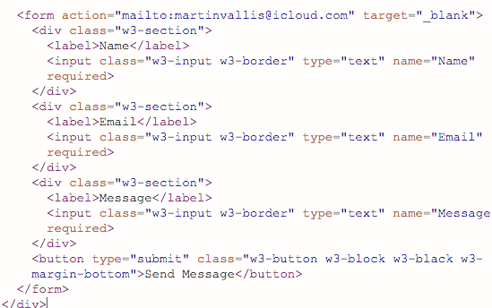
Hello I'm using one of w3 schools responsive templates to build my site. I've put in a contact form but I'm not sure if it's responding correctly? An e mail box does pop up but no name of sender or email address of sender, nor any message. I've attached screen shots, if anyone can confirm where I'm going wrong that would be much appreciated. Many Thanks Martin


-
Okay, I'll check that out, thanks for getting back to me.
-
Hello I've just joined the forum and am brand spanking new to HTML. I've already hit a snag creating a link, the link appears in my browser but when I click on link, I get page cannot be found. I've tried different browsers, Chrome, Safari and Firefox but get the same. any help appreciated. Thanks


