

Jorgensen
-
Posts
26 -
Joined
-
Last visited
Content Type
Profiles
Forums
Events
Everything posted by Jorgensen
-
Inspired by this layout https://cargo.site/Templates#wireframep091 where its possible to move elements freely around, I'm trying to create a fully flowting layout - but I'm quite unsure how to do it the best way - if possible at all (for me). You can see an example here https://rattenborg.com/2022/ What I have done now - I have placed some DIVS, than can be moved around using the concept from this page https://www.w3schools.com/howto/howto_js_draggable.asp, and every time an object is moved, its x and y pos is saved in a MySQL database, where elements are loaded and placed from, when the page reloads. It's working just fine now, but one thing I can't figure out is how to make the layout flexible, so it can be used on different resolutions. The drag function requires the elements to have a absolute position, so I'm quite tied up to that, unless there is a smarter way to achieve what I search for. I sure need to look into how to protect the layout, so visiters can't adjust elements, but right now it's just a proof of concept. If anyone can guide me in the right direction I would be glad 🙂 Jorgensen
-
I would very much like to use edge, and it shows the page just fine, but I can't figure out how to open files via <a href="file://c:/">file</a>. If I enter file://c:/ in the address field edge opens file eplorer just fine - in c:\ But if I add the path as a link on a html page, nothing happens when I press the link 😞
-
Hi dsoesuk It seems that I don't need to struggle with internet explorer, as I can open files with chrome, if i use this method: https://www.techjunkie.com/browse-and-open-folders-files-chrome/ But I'm not sure about security 😕
-
Hi dsoesuk It seems to be a quite old version - 11.885.17134.0, the copyright says 2015. But as I say The real reason why I'm trying to use internet explorer, is that this browser opens windows file explorer when linking to files on local drives, which I'm looking for. Jorgensen
-
But it seems that the w3 classes somehow works - such as w3-dropdown-content. Please see this video: https://www.dropbox.com/s/5vid8rmknzqekbr/20190725_problem.mov?dl=0
-
Hi dsonesuk I'm not sure what you mean, but I use this to like to the style. <link rel="stylesheet" href="https://www.w3schools.com/w3css/4/w3.css"> What I find strange is, that the page works just fine in internet explorer when I run it locally, but when I copy to the server it won't work 😕
-
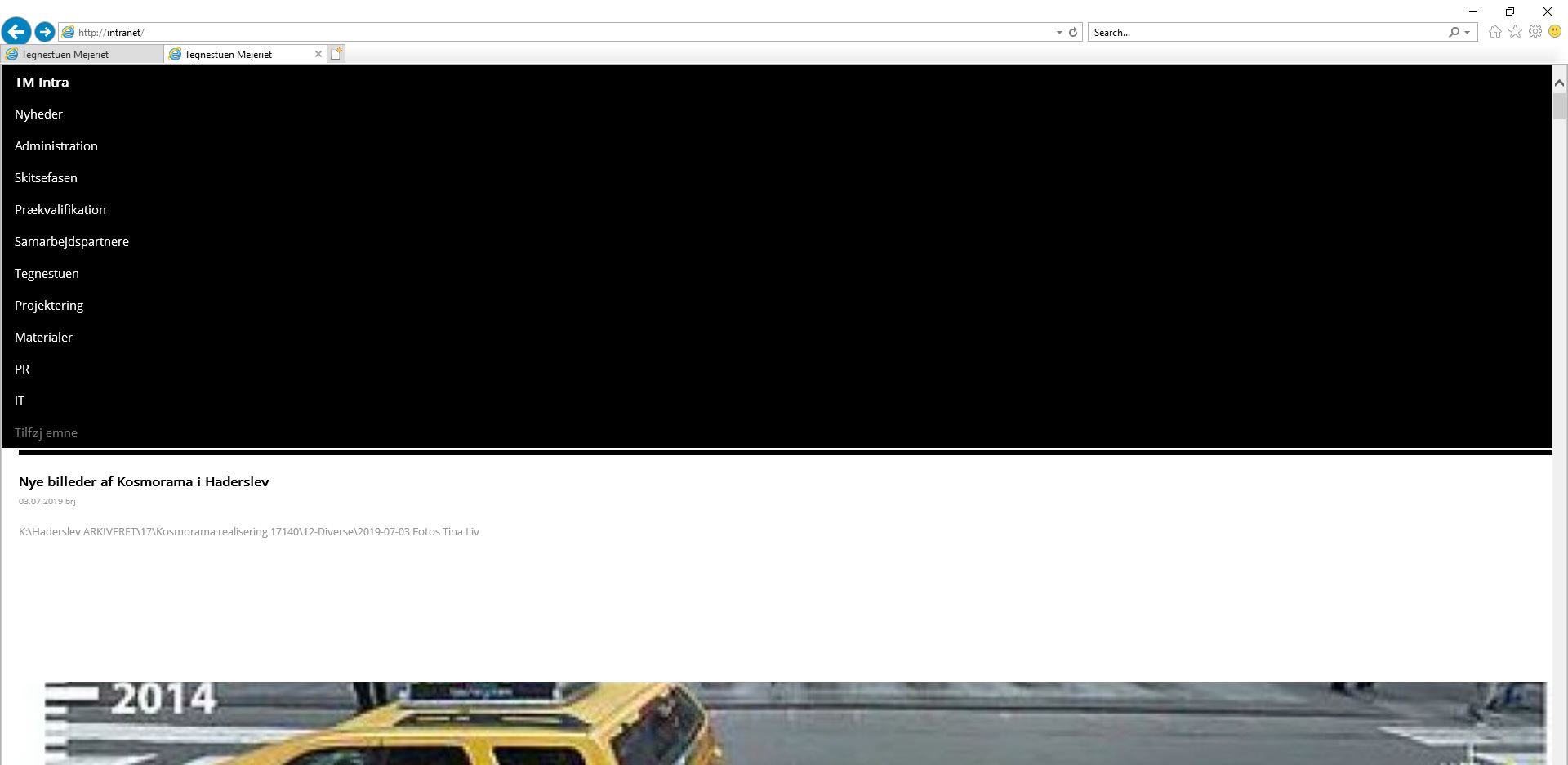
I have constructed a webpage using w3.css. When I see the page in internet explorer on my local computer running usbwebserver.exe, the page looks fine, but when i copy the page to our server - and then access the page via http://intranet/ the layout messes up. Does anyone know what can cause this? ps. The page looks fine in chrome, both local and on the server, but I would like to enable Internet Explorer, as this can open files in File Explorer. Jorgensen


-
Thanks dodra so smart! thanks
-
I found out that it’s quite easy using jquery’s animate :-) thanks you’re welcome.
-
hi i have created a simple menu that uses the w3-animate-left class and opens when the menu icon i pressed. it work fine and looks nice - but when i close the menu i use onclick display:none - this makes the menu go away in a "hard" way. is there an easy way to animate the menu out again? thanks jorgensen
-
hi like the way that this menu pushes the page content when the menu opens w3 examle in the code i can see they use a "zclass" - and i wonder what that is? i have searched w3schools.com, and the only place i find it, is on the page i link to. can anyone explane what this zclass is? are there other / smarter ways to achive this effect - or is this the way to do it? thanks jorgensen
-
I have - created an exact copy of this example (see below) https://www.w3schools.com/w3css/tryit.asp?filename=tryw3css_ref_row - copied the code to a test.html file - copied the file to our company server - copied the to an extern www server Internet explorer displays the exact same file different on intranet vs www. When seen on the intranet internet explorer seems to ignore the setting "w3-row", while it works fine on the www server. Chrome shows the file fine on both intranet and on www. can anyone help solving this issue, as it drives me.............. thanks jorgensen
-
i have an other issue - when i copy the site to our server on the network, for internal testing with colleagues, some layouts messes up in internet explorer - no difference in chrome. it's like the css somehow messes up. the links are blue - the black logo is not hidden as it should bee (only visible on the white background). and most of all - the "nyheder/new" shows as single images in a column, and not as four columns. i guess i have messed up some code :-/ - but it's strange to me that it only happens when the site is copied to our server and not when i run it local, or if i upload to our domain. thanks jorgensen
-
Hi What is the best way to handle webdesign, so the page looks good on both desktop and mobile? i can see if that I setup the layout in a flexible way, the same page shows ok on both platforms. But I think I need to cut down content amount for mobile, and devide the content on several pages. So as I see it, the two things I need is two different menues and content loading platform depended. I have seen some php mobile detection that might work - but is this the right way to handle the two platforms? thanks jorgensen
-
yes - thank you dsonesuk. i did'nt know of "vh", but now had a look at "CSS Units" - so learned something new today :-) thanks jorgensen
-
hi i'n new here - i have done homepage designs on and off for the last twenty as a hobby (i'm no a programmer), mostly using serverside php and the tabels for building the side at clientside. it's now time to update the company site, and that the mobiles has come into the scene i have searched the net to find out how to set flexible sites, and i'ts my impression that i can do a lot with w3.css. but as this is all new to me i have got some problems / questions. i use a <div class="w3-row"> to display some items, and every item is in their own <div class="w3-col l4 w3-margin-bottom"> but if one of the items has more text than others, then the layout jumps around. i'm sure the is a way to avoid this, and that it's quite simple - but i just cant figure out how :-( can anyone help? thanks jorgensen