

J.P
-
Posts
2 -
Joined
-
Last visited
J.P's Achievements
")
Newbie (1/7)
0
Reputation
-
Hi , thank you for replying . if i remove "inlineblock" from the div button CSS, it then doesn't display inline in full browser view. i have fixed the issue with it displaying when expanding the menu in mobile view , however its still appearing the main navbar in mobile view . Any idea's?
-
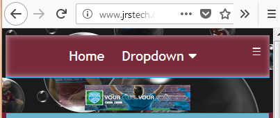
Good Morning , Ive added a menu bar into my test site and it displays fine on desktop , but experiencing issues on phones and tablets . The menu bar does responds and fits to the relevant size of the screen, however the drop down button / link stays at the top in the main part of the nav bar instead of dropping into the relevant order of menu links . Please see the issue here http://www.jrstech.co.uk/OrginalHCForum/ Please could anyone provide some help, i'm sure I've missed something simple ! Thank you for your help in advance . here is my code for the menu bar : <div class="topnav" id="myTopnav"> <a class="nav-link" href="https:\\www.whufc.com">Home</a> <a class="nav-link" href="#">Blogs</a> <a class="nav-link" href="#">Videos</a> <a class="nav-link" href="#">Thames Iron Works</a> <div class="nav-dropdown"> <button class="nav-dropbtn">Dropdown <i class="fa fa-caret-down"></i> </button> <div class="dropdown-content"> <a href="#">Link 1</a> <a href="#">Link 2</a> <a href="#">Link 3</a> </div> </div> <a class="nav-link" href="#">Contact Us</a> <a href="javascript:void(0);" style="font-size:15px;" class="icon" onclick="myFunction()">☰</a> </div> here's my CSS : .topnav { overflow: hidden; background: #782b3a; box-shadow: inset 1px 0 7px 1px rgba(255,255,255,.5); margin-top: 10px; margin-bottom: 10px; padding: 12px ; text-align: center; font: normal normal medium 'Trebuchet MS',Verdana,Arial; border-bottom: 2px solid #1bb1e7; } .active { border-bottom: 4px solid #fff; color: white; } .topnav .icon { display: none; color: #fff; } .nav-dropdown { background: #782b3a; color: #ffffff; font-size: 20px; text-decoration: none; border-top: 0px solid #782b3a; border-bottom: 0px solid #782b3a; padding: 4px 0; margin: 0 10px ; display: inline-block; } .nav-dropdown .nav-dropbtn { font-size: 20px; border: none; outline: none; color: white; background-color: #782b3a; font-family: inherit; margin: 0px; transition: 0.95s ease; background: #782b3a; color: #ffffff; font-size: 20px; text-decoration: none; border-top: 0px solid #782b3a; border-bottom: 0px solid #782b3a; padding: 2px 0; margin: 0 0px ; } .dropdown-content { background-color: #782b3a; border-radius: 13px; display: none; position: absolute; background-color: #782b3a; min-width: 50px; z-index: 1; padding: 0px; } .dropdown-content a { float: none; color: white; padding: 12px 16px; text-decoration: none; display: block; text-align: left; margin-top: 0 10px ; transition: 0.95s ease; border-bottom: 4px solid #782b3a; padding: 2px 0px; } .nav-link { background: #782b3a; color: #ffffff; font-size: 20px; text-decoration: none; border-top: 0px solid #782b3a; border-bottom: 0px solid #782b3a; padding: 2px 0; margin: 0 10px ; display: inline-block; } .nav-link:hover { border-top: 2px solid #782b3a; border-bottom: 3px solid #1bb1e7; padding: 0px 0; color: #ffffff; text-decoration: none; transition: 0.45s ease; } .2topnav a:hover, .dropdown:hover .dropbtn { height: 0px; border-bottom: 44px solid #fff; padding: 3px 50px; } .dropdown-content a:hover { background-color: #fff; color: black; background: #782b3a; color: #ffffff; font-size: 20px; text-decoration: none; border-bottom: 4px solid #1bb1e7; padding: 2px 0; } .nav-dropdown:hover .dropdown-content { display: block; border-bottom: 2px solid #1bb1e7; Padding: 10px 20px; } Here's my responsive code @media screen and (max-width: 600px) { .topnav a:not(:first-child), .dropdown .dropbtn { display: none; } .topnav a.icon { float: right; display: block; } } @media screen and (max-width: 600px) { .topnav.responsive {position: relative;} .topnav.responsive .icon { position: absolute; right: 0; top: 0; } .topnav.responsive a { float: none; display: block; text-align: left; } .topnav.responsive .dropdown {float: left;} .topnav.responsive .dropdown-content {position: relative;} .topnav.responsive .dropdown .dropbtn { display: block; width: 100%; text-align: left; } }
