

bartonlewis
-
Posts
58 -
Joined
-
Last visited
-
Days Won
2
Content Type
Profiles
Forums
Events
Everything posted by bartonlewis
-
Thanks for the explanations. But in the resized window (at 480px), the width should still be 25%. Is it because I have changed the flex-direction to column that that width no longer applies?
-
Thanks to you both for noting the missing braces. Thanks Funce for solving the problem, it worked. It seems like the centre should be the centre - regardless of what margins you set - so I am not sure I am understanding this. There appears to be some conflict with aligning items horizontally and setting left and right margins though.
-
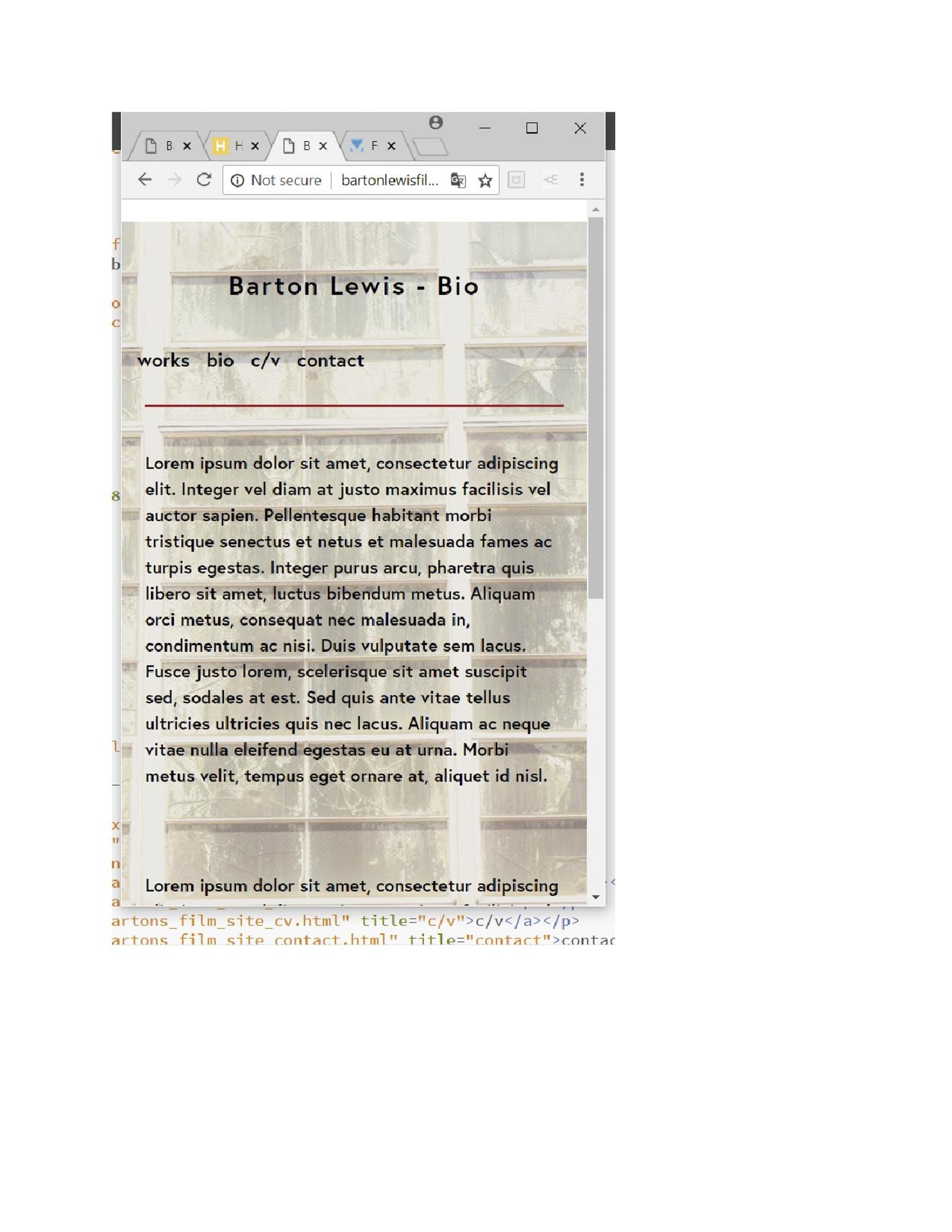
I have a problem with a margin when resizing the browser down to 480px. In the screen shot named "browser2" below, the 1st 3 of 5 links there are showing. When resizing the browser down to 480px, the 1st link ("home") is falling off the page to the left. I can't figure out why. The image "browser1" shows the problem. The image "browser2" shows the same html at 1536px with the 1st 3 links showing. Can anyone help? Thanks. <!DOCTYPE HTML> <html> <head> <link rel="stylesheet" href="https://cdnjs.cloudflare.com/ajax/libs/font-awesome/4.7.0/css/font-awesome.min.css"> <script src="https://use.typekit.net/qkv6kzb.js"></script> <script>try{Typekit.load({ async: true });}catch(e){}</script> <script src="https://use.typekit.net/qkv6kzb.js"></script> <script>try{Typekit.load({ async: true });}catch(e){}</script> <meta charset="UTF-8"> <title>Barton's website</title> <meta name="viewport" content="width=device-width, initial-scale=1"> <!--[if lt IE 9]> <script src="http://html5shiv.googlecode.com/svn/trunk/html5.js"></script> <![endif]--> <style> html { background-color: white; } body { width: auto; margin: 0 auto 0; } .parallax { /* The image used */ background-image: url("img_bckgd_bio.jpg"); /* Set a specific height */ height: auto; /* Create the parallax scrolling effect */ background-attachment: fixed; background-position: center; background-repeat: repeat; background-size: cover; } h2 { font-family: "europa",sans-serif; color: black; text-align: center; font-size: 250%; font-weight: 600; letter-spacing: 2px; padding-top: 10%; margin-bottom: 10%; } body p { font-family: "europa",sans-serif; text-align: left; font-size: 170%; font-weight: 600; color: black; line-height: 150%; } .flex-container { display: -webkit-flex; display: -ms-flexbox; display: flex; justify-content: center; padding: 0 5% 5%; border-top: rgb(180, 37, 37) solid 2px; } .flex1 { width: 25%; margin-top: 5%; } .flex1 p { font-family: "europa",sans-serif; text-align: center; font-size: 150%; padding-bottom: 10%; } .flex2 { width: 50%; margin-top: 5%; } .flex2 p { padding-bottom: 10%; } a { font-family: "europa",sans-serif; text-align: left; text-decoration: none; font-size: 110%; color: black; } a:hover { color: blue; text-decoration: underline; } footer { background: #827e90; height: 25%; } footer p { padding: 5%; font-family: "europa",sans-serif; font-size: 100%; letter-spacing: .8px; color: white; } .flex-container_footer { display: -webkit-flex; display: -ms-flexbox; display: flex; justify-content: space-between; align-items: center; } .flex-container_footer>div { margin: 0px 5%; } .fa { padding: 2%; font-size: ; width: ; text-align: center; text-decoration: none; border-radius: 50%; } .copyright p { font-family: "europa",sans-serif; color: black; font-size: 110%; letter-spacing: .8px; line-height: 135%; font-weight: 500; padding: 10% 0; } /* Add a hover effect if you want */ .fa:hover { opacity: 0.7; } /* Set a specific color for each brand */ /* Facebook */ .fa-facebook { background: #3B5998; color: white; } /* Instagram */ .fa-instagram { background: #3B5998; color: white; } @media screen and (max-width: 1366px) { h2 { font-size: } .flex2 { font-size: } @media screen and (max-width: 1024px) { h2 { font-size: 200%; } .flex2 p { font-size: 150%; } @media screen and (max-width: 768px) { h2 { font-size: 175%; } .flex1 p { font-size: 125%; } .flex2 p { font-size: 125%; } @media screen and (max-width: 480px) { h2 { font-size: 155%; margin-bottom: 5%; } .flex-container { display: -webkit-flex; display: -ms-flexbox; display: flex; flex-direction: column; justify-content: center; padding: 0 5% 5%; border: none; } .flex1 { display: -webkit-flex; display: -ms-flexbox; display: flex; flex-direction: row; justify-content: center; margin: 5% 5% 0; } .flex1 p { font-size: 105%; margin: 0 8% 0; } .flex2 { width: 100%; border-top: rgb(180, 37, 37) solid 2px; } .flex2 p { font-size: 105%; padding-top: 6%; } } </style> </head> <body> <header> </header> <div class="parallax"> <div> <h2>Barton Lewis - Bio</h2> </div> <section class="flex-container"> <div class="flex1"> <p><a href="index.html" title="home">home</a></p> <p><a href="bartons_film_site_works.html" title="works">works</a></p> <p><a href="bartons_film_site_bio.html" title="bio">bio</a></p> <p><a href="bartons_film_site_cv.html" title="c/v">c/v</a></p> <p><a href="bartons_film_site_contact.html" title="contact">contact</a></p> </div> <div class="flex2"> <p>Lorem ipsum dolor sit amet, consectetur adipiscing elit. Integer vel diam at justo maximus facilisis vel auctor sapien. Pellentesque habitant morbi tristique senectus et netus et malesuada fames ac turpis egestas. Integer purus arcu, pharetra quis libero sit amet, luctus bibendum metus. Aliquam orci metus, consequat nec malesuada in, condimentum ac nisi. Duis vulputate sem lacus. Fusce justo lorem, scelerisque sit amet suscipit sed, sodales at est. Sed quis ante vitae tellus ultricies ultricies quis nec lacus. Aliquam ac neque vitae nulla eleifend egestas eu at urna. Morbi metus velit, tempus eget ornare at, aliquet id nisl.</p> <p>Lorem ipsum dolor sit amet, consectetur adipiscing elit. Integer vel diam at justo maximus facilisis vel auctor sapien. Pellentesque habitant morbi tristique senectus et netus et malesuada fames ac turpis egestas. Integer purus arcu, pharetra quis libero sit amet, luctus bibendum metus. Aliquam orci metus, consequat nec malesuada in, condimentum ac nisi. Duis vulputate sem lacus. Fusce justo lorem, scelerisque sit amet suscipit sed, sodales at est. Sed quis ante vitae tellus ultricies ultricies quis nec lacus. Aliquam ac neque vitae nulla eleifend egestas eu at urna. Morbi metus velit, tempus eget ornare at, aliquet id nisl.</p> </div> <div class="flex1"> <p></p> </div> </section> </div> <footer> <div class="flex-container_footer"> <div class="copyright"> <p>copyright © 2017 by Barton Lewis</p> </div> <div> <a href="https://www.facebook.com/profile.php?id=1410465690" class="fa fa-facebook"></a> <a href="https://www.instagram.com/bartonlewis2328/" class="fa fa-instagram"></a> </div> </div> </footer> </body> </html>


-
thanks for your reply. Actually I am not using it for the example I provided, but rather I want to display different artwork in a frame, with the frame hanging in a room and different pieces of art placed in the frame according to the user's clicks. I presume from your reply that templates are something you can use in html and/or css and I will research that for a start.
-
I want to know how to do the following, but I don't even know the name for this effect: You are shopping for a product - say a chair - and the store gives you option to see what it looks like in different fabrics. You click on 5 different fabric swatches and you can view the chair covered in each of those fabrics. What is this effect called and where can you learn about it? Thanks, Barton
-
I am trying to italicize one word in a sentence, and I put it between the <em> tag like so: <em>word</em>. The word does not appear italicized in either Opera or Chrome. Why is this?
-
I don't know a lot about media queries but I created them for a page on my website mainly for the resizing of text and all worked well except for an element which is not moving with other elements inside their container, but is being pushed up above them as you size down the browser window. I've extracted the relevant code and pasted it here. Can anyone tell me what I should be doing to keep the div called "browse" in the same relationship to the slideshow to its right? Thank you. <!DOCTYPE html> <html> <head> <link rel="stylesheet" href="https://cdnjs.cloudflare.com/ajax/libs/font-awesome/4.7.0/css/font-awesome.min.css"> <link rel="stylesheet" href="//maxcdn.bootstrapcdn.com/font-awesome/4.3.0/css/font-awesome.min.css"> <link href='https://fonts.googleapis.com/css?family=Droid+Sans:400,700' rel='stylesheet' type='text/css'> <link rel="stylesheet" href="https://use.typekit.net/qkv6kzb.css"> <script>try{Typekit.load({ async: true });}catch(e){}</script> <script src="https://use.typekit.net/qkv6kzb.js"></script> <script>try{Typekit.load({ async: true });}catch(e){}</script> <meta charset="UTF-8"> <title>Barton's wall cuts</title> <meta name="viewport" content="width=device-width, initial-scale=1"> <!--[if lt IE 9]> <script src="http://html5shiv.googlecode.com/svn/trunk/html5.js"></script> <![endif]--> <style> * {box-sizing: border-box;} body { width: auto; margin: 0 auto 0; } .nav { margin: 0 30px; font-size: 1.8em; } a { color: black; text-decoration: none; } a:hover { text-decoration: underline; } .main { width: auto; display: flex; justify-content: space-between; align-items: center; margin-top: 10%; } .browse { width: 20%; height: 600px; display: flex; flex-direction: column; justify-content: flex-start; margin: 0 5%; font-size: .8em; } h3 { font-family: "europa",sans-serif; font-size: 2.8em; letter-spacing: 1.5px; text-align: center; color: black; margin-top: 35%; margin-bottom: 10%; border-bottom: 2px solid #e00606; padding-bottom: 20%; } h4 { font-family: "europa",sans-serif; font-size: 2.2em; letter-spacing: 1px; text-align: center; margin: 12.5% auto; } a.color { -webkit-transition: color .5s; /* for Safari 3.0 to 6.0 */ transition: color .5s; /* for modern browsers */ text-decoration: none; color: black; } a:hover.color { color: rgb(41, 16, 229); font-weight: 600; font-size: 1.1em; text-decoration: none; } a.styling { -webkit-transition: 0.2s; -moz-transition: 0.2s; -ms-transition: 0.2s; -o-transition: 0.2s; transition: 0.2s; } a:hover.styling { font-family: "blambot-fx-pro",sans-serif; font-size: 1.25em; text-decoration: none; } .zoom { transition: transform .1s; /* Animation*/ } .zoom:hover { transform: scale(2); } .zoomlink:hover { text-decoration: none; } /* CSS FOR SLIDESHOW */ .mySlides {display: none;} img {vertical-align: middle;} /* Slideshow container */ .slideshow-container { display: flex; justify-content: center; } /* Caption text */ .text { color: #f2f2f2; font-size: 15px; padding: 8px 12px; position: absolute; bottom: 8px; text-align: center; } /* Number text (1/3 etc) */ .numbertext { color: #f2f2f2; font-size: 12px; padding: 8px 12px; position: absolute; top: 0; } /* The dots/bullets/indicators */ .dot { height: 15px; width: 15px; margin: 15px 2px; background-color: #bbb; border-radius: 50%; display: inline-block; transition: background-color 0.6s ease; } .active { background-color: #717171; } /* Fading animation */ .fade { -webkit-animation-name: fade; -webkit-animation-duration: 1.5s; animation-name: fade; animation-duration: 1.5s; } @-webkit-keyframes fade { from {opacity: .4} to {opacity: 1} } @keyframes fade { from {opacity: .4} to {opacity: 1} } /* On smaller screens, decrease text size */ @media only screen and (max-width: 300px) { .text {font-size: 11px} } /* END OF CSS FOR SLIDESHOW */ .indent { text-indent: -9999px; } /*---------------MEDIA!!!------------*/ /*----------1920 x 80% = 1536--------*/ @media screen and (max-width: 1536px) { h1 { font-size: 3em; } h2 { font-size: 2.4em; } h3 { font-size: 2.2em; } h4 { font-size: 1.8em; } h5 { font-size: 1.9em; } .indent1 { font-size: 1.6em; } .nav { font-size: 1.4em; } div.about_main p { font-size: 1.25em; } div.about_aside p { font-size: 1.25em; } .extdet { font-size: 1.25em; } .caption { font-size: 1.2em; } .return p { font-size: 1.5em; } } /*--------1536 x 89% = 1367----------*/ @media screen and (max-width: 1366px) { h1 { font-size: 2.7em; } h2 { font-size: 2.1em; } h3 { font-size: 2em; } h4 { font-size: 1.6em; } .indent1 { font-size: 1.4em; } .nav { font-size: 1.25em; } div.about_main p { font-size: 1.25em; } div.about_aside p { font-size: 1.25em; } .caption { font-size: 1.1em; } .return p { font-size: 1.3em; } } /*--------1366 x 75% = 1024----------*/ @media screen and (max-width: 1024px) { h1 { font-size: 2em; } h2 { font-size: 1.6em; } h3 { font-size: 1.5em; } h4 { font-size: 1.2em; } .indent1 { font-size: 1em; } .nav { font-size: 1em; } div.about_main p { font-size: .9375em; } div.about_aside p { font-size: .9375em; } .caption { font-size: .825em; } .return p { font-size: .975em; } } /*--------1024 x 75% = 768----------*/ @media screen and (max-width: 768px) { h1 { font-size: 1.5em; } h2 { font-size: 1.2em; } h3 { font-size: 1.125em; } h4 { font-size: .9em; } .indent1 { font-size: 1em; } .nav { font-size: .75em; } div.about_main p { font-size: .7em; } div.about_aside p { font-size: .7em; } .caption { font-size: .6em; } .return p { font-size: .73em; } } </style> </head> <body> <section class="main"> <div class="browse"> <h3>Browse by</h3> <h4><a class="color" href="photography_browse_color.html" title="Color">Color</a></h4> <h4><a class="styling" href="photography_browse_style.html" title="Style">Style</a></h4> <h4 class="zoom"><a class="zoomlink" href="photography_browse_size.html" title="Size"><span>Size</span></a></h4> </div> <div class="slideshow-container"> <div class="mySlides fade"> <div class="numbertext">1 / 7</div> <img src="http://bartonlewisfilm.com/img_287-163_1500.jpg" style="max-width: 100%" alt="287-163, Flushing Ave., IND Crosstown Line" style="width:80%"> <div class="text"></div> </div> <div class="mySlides fade"> <div class="numbertext">2 / 7</div> <img src="http://bartonlewisfilm.com/img_162-373_1500.jpg" style="max-width: 100%" alt="162-373, 50th St., IND Eighth Ave. Line" style="width:80%"> <div class="text"></div> </div> <div class="mySlides fade"> <div class="numbertext">3 / 7</div> <img src="http://bartonlewisfilm.com/img_coors_light_1500.jpg" style="max-width: 100%" alt="Coors Light, 135th St., IND Eighth Ave. Line " style="width:80%"> <div class="text"></div> </div> <div class="mySlides fade"> <div class="numbertext">4 / 7</div> <img src="http://bartonlewisfilm.com/img_287-135_1500.jpg" style="max-width: 100%" alt="287-135, Flushing Ave., IND Crosstown Line" style="width:80%"> <div class="text"></div> </div> <div class="mySlides fade"> <div class="numbertext">5 / 7</div> <img src="http://bartonlewisfilm.com/img_157-245_1500.jpg" style="max-width: 100%" alt="157-245, 96th St., IND Eighth Ave. Line" style="width:80%"> <div class="text"></div> </div> <div class="mySlides fade"> <div class="numbertext">6 / 7</div> <img src="http://bartonlewisfilm.com/img_in_theaters_1500.jpg" style="max-width: 100%" alt="in theaters, Elmhurst Ave., IND Queens Blvd. Line " style="width:100%"> <div class="text"></div> </div> <div class="mySlides fade"> <div class="numbertext">7 / 7</div> <img src="http://bartonlewisfilm.com/img_287-159_1500.jpg" style="max-width: 100%" alt="287-159, Flushing Ave., IND Crosstown Line" style="width:80%"> <div class="text"></div> </div> </div> <div class="browse"> <p class="indent">Oversize</p> </div> </section> <div style="text-align:center"> <span class="dot"></span> <span class="dot"></span> <span class="dot"></span> <span class="dot"></span> <span class="dot"></span> <span class="dot"></span> <span class="dot"></span> </div> <script> var slideIndex = 0; showSlides(); function showSlides() { var i; var slides = document.getElementsByClassName("mySlides"); var dots = document.getElementsByClassName("dot"); for (i = 0; i < slides.length; i++) { slides[i].style.display = "none"; } slideIndex++; if (slideIndex > slides.length) {slideIndex = 1} for (i = 0; i < dots.length; i++) { dots[i].className = dots[i].className.replace(" active", ""); } slides[slideIndex-1].style.display = "block"; dots[slideIndex-1].className += " active"; setTimeout(showSlides, 3000); // Change image every 3 seconds } </script> </body> </html>
-
 I found cool code for a magnifying lens on multiple images; but I want to make the images resize on different browser sizes. Since the code relies on defining the size of the image within the image tag, I am not sure how to do this. On the previous version of my page, where I did not use the magnifying lens, I created a class for the image which gave it a width: X% which enabled it be responsive. But that won't work here. Does anybody know of a solution? I am not js-experienced so I would need the code written for me, instead of being told what to do. Sorry, and thanks if anyone can help. <!DOCTYPE HTML> <html> <head> <link rel="stylesheet" href="https://cdnjs.cloudflare.com/ajax/libs/font-awesome/4.7.0/css/font-awesome.min.css"> <script type="text/javascript" src="magnifier.js"></script> <script src="https://use.typekit.net/qkv6kzb.js"></script> <script>try{Typekit.load({ async: true });}catch(e){}</script> <script src="https://use.typekit.net/qkv6kzb.js"></script> <script>try{Typekit.load({ async: true });}catch(e){}</script> <meta charset="UTF-8"> <title>Barton Lewis - photography - wall cuts</title> <meta name="viewport" content="width=device-width, initial-scale=1"> <!--[if lt IE 9]> <script src="http://html5shiv.googlecode.com/svn/trunk/html5.js"></script> <![endif]--> <style> img { width: 100%; height: auto; } /* styles for magnifier image pairs */ .container { display: flex; justify-content: space-around; margin: 2% 0; } .caption { font-family: "europa",sans-serif; text-align: center; font-size: 1.5em; margin: 4% auto 5%; } /* style for the DIV that holds the image pair */ .magnifier { overflow: hidden; position: relative; display: flex; justify-content: space-between; } /* style for the DIV that is the magnifier lens */ .maglens { position: absolute; overflow: hidden; width: 200px; height: 200px; display: flex; justify-content: space-around; } /* style for the small IMG that appears on the page */ .magsmall { position: absolute; border-style: none } /* style for the magnified image, using a clip rectangle */ .maglarge { position: absolute; border-style: none; } /*---------------MEDIA!!!------------*/ @media screen and (max-width: 1366px) { .caption { font-family: "europa",sans-serif; font-size: 1.2em; } } @media screen and (max-width: 768px) { .caption { font-family: "europa",sans-serif; font-size: 1em; } } </style> </head> <body> <div class="container"> <div class="magnifier" style="width: 825px; height: 635px;"> <div class="maglens"> <img src="http://bartonlewisfilm.com/img_157-229_1500.jpg" class="maglarge" style="width: 1500px; height: 1155px;" /> </div> </div> </div> <p class="caption">287-135, Flushing Ave., IND Crosstown Line</p> <div class="container"> <div class="magnifier" style="width: 825px; height: 628px;"> <div class="maglens"> <img src="http://bartonlewisfilm.com/img_157-245_1500.jpg" class="maglarge" style="width: 1500px; height: 1142px;" /> </div> </div> </div> <p class="caption">157-245, 96th St., IND Eighth Ave. Line</p> <div class="container"> <div class="magnifier" style="width: 825px; height: 653px;"> <div class="maglens"> <img src="http://bartonlewisfilm.com/img_162-365_1500.jpg" class="maglarge" style="width: 1500px; height: 1187px;" /> </div> </div> </div> <p class="caption">162-365, 50th St., IND Eighth Ave. Line</p> <script> </script> </body> </html>
 -
browser window not resizing for text per media queries
bartonlewis replied to bartonlewis's topic in CSS
Thank you. Simply putting the media queries in the correct order made them work. -
I wrote media queries which until recently worked - the images are still resizing but for some reason the text has stopped resizing when I make the window smaller. I don't know what I might have done to render them non-functionable. Can anyone spot what it might be? Thank you very much. <!DOCTYPE html> <html> <head> <link rel="stylesheet" href="https://cdnjs.cloudflare.com/ajax/libs/font-awesome/4.7.0/css/font-awesome.min.css"> <script src="https://use.typekit.net/qkv6kzb.js"></script> <script>try{Typekit.load({ async: true });}catch(e){}</script> <script src="https://use.typekit.net/qkv6kzb.js"></script> <script>try{Typekit.load({ async: true });}catch(e){}</script> <meta charset="UTF-8"> <title>Barton's wall cuts</title> <meta name="viewport" content="width=device-width, initial-scale=1"> <!--[if lt IE 9]> <script src="http://html5shiv.googlecode.com/svn/trunk/html5.js"></script> <![endif]--> <style> /* http://meyerweb.com/eric/tools/css/reset/ v2.0 | 20110126 License: none (public domain) */ html, body, div, span, applet, object, iframe, h1, h2, h3, h4, h5, h6, p, blockquote, pre, a, abbr, acronym, address, big, cite, code, del, dfn, em, img, ins, kbd, q, s, samp, small, strike, strong, sub, sup, tt, var, b, u, i, center, dl, dt, dd, ol, ul, li, fieldset, form, label, legend, table, caption, tbody, tfoot, thead, tr, th, td, article, aside, canvas, details, embed, figure, figcaption, footer, header, hgroup, menu, nav, output, ruby, section, summary, time, mark, audio, video { margin: 0; padding: 0; border: 0; font-size: 100%; font: inherit; vertical-align: baseline; } /* HTML5 display-role reset for older browsers */ article, aside, details, figcaption, figure, footer, header, hgroup, menu, nav, section, paragraph { display: block; } body { line-height: 1; } ol, ul { list-style: none; } blockquote, q { quotes: none; } blockquote:before, blockquote:after, q:before, q:after { content: ''; content: none; } table { border-collapse: collapse; border-spacing: 0; } /*THIS IS THE END OF THE MYER RESET*/ * {box-sizing: border-box;} body { width: auto; margin: 0 auto 0; } .parallax { /* The image used */ background-image: url("img_bckgd_windows_7283_1920-4.jpg"); /* Set a specific height */ height: auto; /* Create the parallax scrolling effect */ background-attachment: fixed; background-position: center; background-repeat: repeat; background-size: cover; padding-bottom: 1%; } h1 { font-family: "europa",sans-serif; font-size: 3.6em; letter-spacing: .3em; text-align: center; color: black; padding: 5% 0; padding-top: 7%; } h2 { font-family: "europa",sans-serif; font-size: 2.8em; color: black; letter-spacing: .2em; text-align: center; padding-bottom: 5%; } .flex-container { display: -webkit-flex; display: -ms-flexbox; display: flex; margin: 0 50px 50px 50px; padding-bottom: 30px; align-items: center; justify-content: center; font-family: "europa",sans-serif; font-size: 105%; } .nav { margin: 0 30px; } a { text-decoration: none; color: black; } div.nav a { font-size: 1.8em; } .main { width: auto; display: flex; justify-content: space-between; align-items: center; margin-top: 100px; } .browse { width: 20%; margin: 0 5%; } h3 { font-family: "europa",sans-serif; font-size: 2em; letter-spacing: 1.5px; text-align: center; color: 4d4d4d; border-bottom: 2px solid #c30505; padding: 10% 0; } h4 { font-family: "europa",sans-serif; font-size: 1.7em; letter-spacing: 1px; text-align: left; color: 4d4d4d; font-variant: small-caps; padding: 10% 0; } p.indent1 { text-indent: 1em; line-height: 1.3em; font-family: "europa",sans-serif; font-size: 1.4em; color: black; display: block; margin: 0; } /* CSS FOR SLIDESHOW */ .mySlides {display: none;} img {vertical-align: middle;} /* Slideshow container */ .slideshow-container { display: flex; justify-content: center; width: ; } /* Caption text */ .text { color: #f2f2f2; font-size: 15px; padding: 8px 12px; position: absolute; bottom: 8px; text-align: center; } /* Number text (1/3 etc) */ .numbertext { color: #f2f2f2; font-size: 12px; padding: 8px 12px; position: absolute; top: 0; } /* The dots/bullets/indicators */ .dot { height: 15px; width: 15px; margin: 15px 2px; background-color: #bbb; border-radius: 50%; display: inline-block; transition: background-color 0.6s ease; } .active { background-color: #717171; } /* Fading animation */ .fade { -webkit-animation-name: fade; -webkit-animation-duration: 1.5s; animation-name: fade; animation-duration: 1.5s; } @-webkit-keyframes fade { from {opacity: .4} to {opacity: 1} } @keyframes fade { from {opacity: .4} to {opacity: 1} } /* On smaller screens, decrease text size */ @media only screen and (max-width: 300px) { .text {font-size: 11px} } /* END OF CSS FOR SLIDESHOW */ .indent { text-indent: -9999px; } .about { width: 66%; margin: 0 auto; margin-top: 5%; } .about p { padding: 15px; line-height: 1.3em; font-family: "europa",sans-serif; font-size: 1.75em; color: black; } .underline { text-decoration: underline; font-variant: small-caps; font-size: 1.1em; } a:hover { text-decoration: underline; } footer { background: #827e90; height: 75px; margin-top: 5%; } footer p { padding: 25px; font-family: "europa",sans-serif; font-size: 1.1em; letter-spacing: .8px; color: white; } .flex-container-footer { display: -webkit-flex; display: -ms-flexbox; display: flex; height: 100%; padding-top: 0px; justify-content: space-between; align-items: center; } .flex-container-footer>div { margin: 0px 50px; } .social a { color: white; } .fa { padding: 10px; font-size: ; width: ; text-align: center; text-decoration: none; border-radius: 50%; } .copyright p { font-family: "europa",sans-serif; color: black; font-size: 1.1em; letter-spacing: .8px; line-height: 135%; font-weight: 500; } /*---------------MEDIA!!!------------*/ @media screen and (max-width: 768px) { html { width: 100%; } h1 { font-size: 2em; } h2 { font-size: 1.4em; } h3 { font-size: 1em; } h4 { font-size: 1em; } p.indent1 { font-size: .8em; } div.nav a { font-size: 1.3em; } div.about p { font-size: 1em; } } @media screen and (max-width: 1366px) { html { width: 100%; } h1 { font-size: 2.6em; } h2 { font-size: 2.2em; } h3 { font-size: 1.6em; } h4 { font-size: 1.3em; } p.indent1 { font-size: 1em; } div.nav a { font-size: 1.3em; } div.about p { font-size: 1.25em; } } </style> </head> <body> <div class="parallax"> <div> <h1>Barton Lewis</h1> <h2>wall cuts</h2> </div> <section class="flex-container"> <div class="nav"><a href="index.html" title="home">home</a></div> <div class="nav"><a href="bartons_film_site_works.html" title="works">works</a></div> <div class="nav"><a href="bartons_film_site_bio.html" title="bio">bio</a></div> <div class="nav"><a href="bartons_film_site_cv.html" title="c/v">c/v</a></div> <div class="nav"><a href="bartons_film_site_contact.html" title="contact">contact</a></div> </section> </div> <section class="main"> <div class="browse"> <h3>Browse</h3> <h4>By color</h4> <p class="indent1"><a href="photography_gallery_color_earth_tones.html" title="Earth tones">Earth tones</a></p> <p class="indent1"><a href="photography_gallery_color_yellows_&_greens.html" title="yellows and greens">Yellows and greens</a></p> <p class="indent1"><a href="photography_gallery_color_purples_&_blues.html" title="purples and blues">Purples and blues</a></p> <p class="indent1"><a href="photography_gallery_color_blacks.html" title="blacks">Blacks</a></p> <h4>By style</h4> <p class="indent1"><a href="photography_gallery_style_ab-ex.html" title="Ab-Ex">Ab-Ex</a></p> <p class="indent1"><a href="photography_gallery_style_color_field.html" title="Color field">Color Field</a></p> <p class="indent1"><a href="photography_gallery_style_graphical.html" title="Graphical">Graphical</a></p> <h4>By size / format</h4> <p class="indent1"><a href="photography_gallery_size_portrait.html" title="Portrait">Portrait</a></p> <p class="indent1"><a href="photography_gallery_size_landscape.html" title="Standard">Landscape</a></p> <p class="indent1"><a href="photography_gallery_size_oversize.html" title="Oversize">Oversize</a></p> </div> <div class="slideshow-container"> <div class="mySlides fade"> <div class="numbertext">1 / 8</div> <img src="http://bartonlewisfilm.com/img_287-163.jpg" style="max-width: 100%" alt="157-245, 96th St., IND Eighth Ave. Line" style="width:80%"> <div class="text"></div> </div> <div class="mySlides fade"> <div class="numbertext">2 / 8</div> <img src="http://bartonlewisfilm.com/img_162-373.jpg" style="max-width: 100%" alt="157-245, 96th St., IND Eighth Ave. Line" style="width:80%"> <div class="text"></div> </div> <div class="mySlides fade"> <div class="numbertext">3 / 8</div> <img src="http://bartonlewisfilm.com/img_coors_light.jpg" style="max-width: 100%" alt="157-245, 96th St., IND Eighth Ave. Line" style="width:80%"> <div class="text"></div> </div> <div class="mySlides fade"> <div class="numbertext">4 / 8</div> <img src="http://bartonlewisfilm.com/img_287-135.jpg" style="max-width: 100%" alt="157-245, 96th St., IND Eighth Ave. Line" style="width:80%"> <div class="text"></div> </div> <div class="mySlides fade"> <div class="numbertext">5 / 8</div> <img src="http://bartonlewisfilm.com/img_214-041.jpg" style="max-width: 100%" alt="157-245, 96th St., IND Eighth Ave. Line" style="width:80%"> <div class="text"></div> </div> <div class="mySlides fade"> <div class="numbertext">6 / 8</div> <img src="http://bartonlewisfilm.com/img_157-245.jpg" style="max-width: 100%" alt="157-245, 96th St., IND Eighth Ave. Line" style="width:80%"> <div class="text"></div> </div> <div class="mySlides fade"> <div class="numbertext">7 / 8</div> <img src="http://bartonlewisfilm.com/img_in_theaters.JPG" style="max-width: 100%" alt="in theaters, Elmhurst Ave., IND Queens Blvd. Line " style="width:100%"> <div class="text"></div> </div> <div class="mySlides fade"> <div class="numbertext">8 / 8</div> <img src="http://bartonlewisfilm.com/img_287-159.jpg" style="max-width: 100%" alt="157-245, 96th St., IND Eighth Ave. Line" style="width:80%"> <div class="text"></div> </div> </div> <div class="browse"> <p class="indent">Oversize</p> </div> </section> <div style="text-align:center"> <span class="dot"></span> <span class="dot"></span> <span class="dot"></span> <span class="dot"></span> <span class="dot"></span> <span class="dot"></span> <span class="dot"></span> <span class="dot"></span> </div> <div class="about"> <p>Lorem ipsum dolor sit amet, consectetur adipiscing elit, sed do eiusmod tempor incididunt ut labore et dolore magna aliqua. Ut enim ad minim veniam, quis nostrud exercitation ullamco laboris nisi ut aliquip ex ea commodo consequat. Duis aute irure dolor in reprehenderit in voluptate velit esse cillum dolore eu fugiat nulla pariatur. Excepteur sint occaecat cupidatat non proident, sunt in culpa qui officia deserunt mollit anim id est laborum.</p> </div> <script> var slideIndex = 0; showSlides(); function showSlides() { var i; var slides = document.getElementsByClassName("mySlides"); var dots = document.getElementsByClassName("dot"); for (i = 0; i < slides.length; i++) { slides[i].style.display = "none"; } slideIndex++; if (slideIndex > slides.length) {slideIndex = 1} for (i = 0; i < dots.length; i++) { dots[i].className = dots[i].className.replace(" active", ""); } slides[slideIndex-1].style.display = "block"; dots[slideIndex-1].className += " active"; setTimeout(showSlides, 3000); // Change image every 3 seconds } </script> <footer> <div class="flex-container-footer"> <div> <p>copyright © 2018 by Barton Lewis</p> </div> <div class="social"> <a href="https://www.facebook.com/profile.php?id=1410465690" class="fa fa-facebook"></a> <a href="https://www.instagram.com/bartonlewis2328/" class="fa fa-instagram"></a> </div> </div> </footer> <script> </script> </body> </html>
-
Oops, you are so right. Everything working perfectly now. Thank you!!
- 2 replies
-
- 1
-

-
- block level elements
- css
- (and 1 more)
-
I have some social nav's at the bottom of my page in the footer which are not appearing. On another page with almost identical css the nav's appear. I can't detect the difference in the 2 pages except one is controlled by an external style sheet (where it's not working properly) and the other the css is inside the html document. I've pasted the relevant html and css below. Can anyone tell me why the facebook and instagram nav's don't appear? Thank you. <!DOCTYPE html> <html> <head><link rel="stylesheet" type="text/css" href="mystyle.css"> <script src="https://use.typekit.net/qkv6kzb.js"></script> <script>try{Typekit.load({ async: true });}catch(e){}</script> <script src="https://use.typekit.net/qkv6kzb.js"></script> <script>try{Typekit.load({ async: true });}catch(e){}</script> <meta charset="UTF-8"> <title>Barton Lewis - photography - wall cuts</title> <meta name="viewport" content="width=device-width, initial-scale=1"> <!--[if lt IE 9]> <script src="http://html5shiv.googlecode.com/svn/trunk/html5.js"></script> <![endif]--> <style> body { font-family: "europa",sans-serif; margin: 0; } .parallax { /* The image used */ background-image: url("http://bartonlewisfilm.com/img_bckgd_windows_7283_1920-3.jpg"); /* Set a specific height */ height: auto; /* Create the parallax scrolling effect */ background-attachment: fixed; background-position: center; background-repeat: repeat; background-size: cover; padding-bottom: 1%; } h1 { font-family: "europa",sans-serif; font-size: 3.6em; letter-spacing: .3em; text-align: center; color: black; padding: 5% 0; padding-top: 7%; } h2 { font-family: "europa",sans-serif; font-size: 2.8em; color: black; letter-spacing: .2em; text-align: center; padding-bottom: 5%; } h3 { font-family: "europa",sans-serif; font-size: 2.2em; color: black; letter-spacing: 1.5px; text-align: center; padding-bottom: 1%; } h4 { font-family: "europa",sans-serif; font-size: 2em; color: black; letter-spacing: 1.5px; text-align: center; padding-bottom: 1%; } .flex-container { display: -webkit-flex; display: -ms-flexbox; display: flex; margin: 0 50px 50px 50px; padding-bottom: 30px; align-items: center; justify-content: center; font-family: "europa",sans-serif; font-size: 105%; } .nav { margin: 0 30px; } a { text-decoration: none; color: black; } div.nav a { font-size: 1.8em; } .category { margin: 7% 0; } .container { margin: 0 auto; } .container p { font-size: 1.6em; margin: 10% 30%; line-height: 125%; } .wallcut { margin: 6% auto 10%; } div.wallcut p { text-align: center; font-size: 1.6em; margin: 4% auto 5%; } .underline { text-decoration: underline; font-variant: small-caps; } a:hover { text-decoration: underline; } img { vertical-align: middle; } .center_width { display: block; margin-left: auto; margin-right: auto; width: 58%; } p.return { font-size: 2em; } footer { background: #827e90; height: 75px; margin-top: 5%; } footer p { padding: 25px; font-family: "europa",sans-serif; font-size: 100%; letter-spacing: .8px; color: white; } .flex-container-footer { display: -webkit-flex; display: -ms-flexbox; display: flex; height: 100%; padding-top: 0px; justify-content: space-between; align-items: center; } .flex-container-footer>div { margin: 0px 50px; } .social a { color: white; } .fa { padding: 10px; font-size: ; text-align: center; text-decoration: none; border-radius: 50%; } .copyright p { font-family: "europa",sans-serif; color: black; font-size: 80%; letter-spacing: .8px; line-height: 135%; font-weight: 500; } </style> </head> <body> <div class="parallax"> <h1 style="text-align:center">Barton Lewis</h1> <h2 style="text-align:center">wall cuts</h2> <section class="flex-container"> <div class="nav"><a href="index.html" title="home">home</a></div> <div class="nav"><a href="bartons_film_site_works.html" title="works">works</a></div> <div class="nav"><a href="bartons_film_site_bio.html" title="bio">bio</a></div> <div class="nav"><a href="bartons_film_site_cv.html" title="c/v">c/v</a></div> <div class="nav"><a href="bartons_film_site_contact.html" title="contact">contact</a></div> </section> </div> <div class="category"> <h3 style="text-align:center">Blacks</h3> </div> <div class="container"> <div class="wallcut"> <img src="img_287-135.jpg" alt="287-135, Flushing Ave., IND Crosstown Line" class="center_width"> <p>287-135, Flushing Ave., IND Crosstown Line</p> </div> </div> <p class="return" style="text-align:center"><a href="photography.html">Back</a> to main wall cuts page.</p> <footer> <div class="flex-container-footer"> <div> <p>copyright © 2018 by Barton Lewis</p> </div> <div class="social"> <a href="https://www.facebook.com/profile.php?id=1410465690" class="fa fa-facebook"></a> <a href="https://www.instagram.com/bartonlewis2328/" class="fa fa-instagram"></a> </div> </div> </footer> <script> </script> </body> </html>
-
when an element's width is undefined, what determines it?
bartonlewis replied to bartonlewis's topic in CSS
On the page, I am right clicking in the area that I want to inspect and then selecting "Inspect" (in Chrome) or "Inspect element" (in Opera - I may have misspoke earlier and said Safari). In the panel that comes up, I am clicking on the elements I want to see results for. -
when an element's width is undefined, what determines it?
bartonlewis replied to bartonlewis's topic in CSS
Okay. I don't understand why my 1366px monitor reports 1108px and 756px on the 2 different browsers, and the 1920 monitor reports 1348px. Oh well, thanks anyway. -
when an element's width is undefined, what determines it?
bartonlewis replied to bartonlewis's topic in CSS
Thank you. I stripped all but the first image on the page to make it leaner, and pasted it below. (Doing this did not affect the results that "inspect element" was reporting in Chrome and Safari.) If you wouldn't mind taking a look, I'd be greatly appreciative. Chrome reports 1108px for the html and body elements, and Safari reports 756px. Microsoft Edge didn't report a pixel size, but it says "box-sizing: border-box." This is the value assigned to the universal selector. I wondered if was the culprit and deleted it and no change. The only other thing that I thought could be responsible was the "center-width" class in the image. But I still don't understand why the 2 browsers report different widths, in addition to what is actually determining the widths that are reported (for <body> and <html>). <!DOCTYPE html> <html> <head><link rel="stylesheet" type="text/css" href="mystyle.css"> <script src="https://use.typekit.net/qkv6kzb.js"></script> <script>try{Typekit.load({ async: true });}catch(e){}</script> <script src="https://use.typekit.net/qkv6kzb.js"></script> <script>try{Typekit.load({ async: true });}catch(e){}</script> <meta charset="UTF-8"> <title>Barton Lewis - photography - wall cuts</title> <meta name="viewport" content="width=device-width, initial-scale=1"> <!--[if lt IE 9]> <script src="http://html5shiv.googlecode.com/svn/trunk/html5.js"></script> <![endif]--> </head> <body> <div class="parallax"> <h1 style="text-align:center">Barton Lewis</h1> <h2 style="text-align:center">wall cuts</h2> <section class="flex-container"> <div class="nav"><a href="index.html" title="home">home</a></div> <div class="nav"><a href="bartons_film_site_works.html" title="works">works</a></div> <div class="nav"><a href="bartons_film_site_bio.html" title="bio">bio</a></div> <div class="nav"><a href="bartons_film_site_cv.html" title="c/v">c/v</a></div> <div class="nav"><a href="bartons_film_site_contact.html" title="contact">contact</a></div> </section> </div> <div class="category"> <h3 style="text-align:center">Blacks</h3> </div> <div class="container"> <div class="wallcut"> <img src="http://bartonlewisfilm.com/img_287-135.jpg" alt="287-135, Flushing Ave., IND Crosstown Line" class="center_width"> <p>287-135, Flushing Ave., IND Crosstown Line</p> </div> </div> <p class="return" style="text-align:center"><a href="photography_rework.html">Back</a> to main wall cuts page.</p> <footer> <div class="flex-container-footer"> <div> <p>copyright © 2018 by Barton Lewis</p> </div> <div class="social"> <a href="https://www.facebook.com/profile.php?id=1410465690" class="fa fa-facebook"></a> <a href="https://www.instagram.com/bartonlewis2328/" class="fa fa-instagram"></a> </div> </div> </footer> <script> </script> </body> </html> -
when an element's width is undefined, what determines it?
bartonlewis replied to bartonlewis's topic in CSS
Thank you. When you say "the container of the <html> would be the window itself," then if I am on a 1366px monitor, shouldn't the width be 1366px, and if I am on a 1920px monitor, shouldn't the width be 1920px? Or does "window" mean something other than the screen size of your device? My page has an html width of 1108px on my 1366px monitor, and a width of 1348px on my 1920px monitor. The width of the <html> isn't taking its width from one of its child elements, is it? -
I have a number of web pages that are controlled by an external style sheet. I am pasting the css stylesheet in its entirety. My questions are: all of the web pages have an html and body element with a width of 1108px. (1) What is determining the width of these 2 elements? (2) What is the best practice for defining these elements? I want the web pages to be responsive to different browser sizes. Does defining fixed width constrain an element's responsive behavior? /* http://meyerweb.com/eric/tools/css/reset/ v2.0 | 20110126 License: none (public domain) */ html, body, div, span, applet, object, iframe, h1, h2, h3, h4, h5, h6, p, blockquote, pre, a, abbr, acronym, address, big, cite, code, del, dfn, em, img, ins, kbd, q, s, samp, small, strike, strong, sub, sup, tt, var, b, u, i, center, dl, dt, dd, ol, ul, li, fieldset, form, label, legend, table, caption, tbody, tfoot, thead, tr, th, td, article, aside, canvas, details, embed, figure, figcaption, footer, header, hgroup, menu, nav, output, ruby, section, summary, time, mark, audio, video { margin: 0; padding: 0; border: 0; font-size: 100%; font: inherit; vertical-align: baseline; } /* HTML5 display-role reset for older browsers */ article, aside, details, figcaption, figure, footer, header, hgroup, menu, nav, section { display: block; } body { line-height: 1; } ol, ul { list-style: none; } blockquote, q { quotes: none; } blockquote:before, blockquote:after, q:before, q:after { content: ''; content: none; } table { border-collapse: collapse; border-spacing: 0; } /*THIS IS THE END OF THE MYER RESET*/ body { font-family: "europa",sans-serif; margin: 0; } .parallax { /* The image used */ background-image: url("img_bckgd_windows_7283_1920-3.jpg"); /* Set a specific height */ height: auto; /* Create the parallax scrolling effect */ background-attachment: fixed; background-position: center; background-repeat: repeat; background-size: cover; padding-bottom: 1%; } h1 { font-family: "europa",sans-serif; font-size: 3.6em; letter-spacing: .3em; text-align: center; color: black; padding: 5% 0; padding-top: 7%; } h2 { font-family: "europa",sans-serif; font-size: 2.8em; color: black; letter-spacing: .2em; text-align: center; padding-bottom: 5%; } h3 { font-family: "europa",sans-serif; font-size: 2.2em; color: black; letter-spacing: 1.5px; text-align: center; padding-bottom: 1%; } h4 { font-family: "europa",sans-serif; font-size: 2em; color: black; letter-spacing: 1.5px; text-align: center; padding-bottom: 1%; } .container_blank_space_small { height: 26px; } .container_blank_space_big { height: 39px; } .container_blank_space_big p, .container_blank_space_small p { text-indent: -9999px; } .flex-container { display: -webkit-flex; display: -ms-flexbox; display: flex; margin: 0 50px 50px 50px; padding-bottom: 30px; align-items: center; justify-content: center; font-family: "europa",sans-serif; font-size: 105%; } .nav { margin: 0 30px; } a { text-decoration: none; color: black; } div.nav a { font-size: 1.8em; } .category { margin: 7% 0; } .container { width: 100%; margin: 0 auto; } .container p { font-size: 1.6em; margin: 10% 30%; line-height: 125%; } .wallcut { margin: 6% auto 10%; } div.wallcut p { text-align: center; font-size: 1.2em; margin: 4% auto 5%; } .underline { text-decoration: underline; font-variant: small-caps; } a:hover { text-decoration: underline; } * { box-sizing: border-box; } img { vertical-align: middle; } .center_width { display: block; margin-left: auto; margin-right: auto; width: 58%; } .center_height { display: block; margin-left: auto; margin-right: auto; width: 24%; } .center_oversize { display: block; margin-left: auto; margin-right: auto; width: 90%; } p.return { font-size: 2em; } footer { background: #827e90; height: 75px; margin-top: 5%; } footer p { padding: 25px; font-family: "europa",sans-serif; font-size: 100%; letter-spacing: .8px; color: white; } .flex-container-footer { display: -webkit-flex; display: -ms-flexbox; display: flex; width: 100%; height: 100%; padding-top: 0px; justify-content: space-between; align-items: center; } .flex-container-footer>div { margin: 0px 50px; } .social a { color: white; } .fa { padding: 10px; font-size: ; width: ; text-align: center; text-decoration: none; border-radius: 50%; } .copyright p { font-family: "europa",sans-serif; color: black; font-size: 80%; letter-spacing: .8px; line-height: 135%; font-weight: 500; } /*---------------MEDIA!!!------------*/ @media screen and (max-width: 768px) { h1 { font-size: 2em; } h2 { font-size: 1.4em; } h3 { font-size: 1.2em; } h4 { font-size: 1em; } div.wallcut p { font-size: .9em; } p.indent1 { font-size: 1em; } div.nav a { font-size: 1.3em; } div.about p { font-size: 1.25em; } } @media screen and (max-width: 1366px) { h1 { font-size: 2.6em; } h2 { font-size: 2em; } h3 { font-size: 1.6em; } h4 { font-size: 1.3em; } .indent1 { font-size: 1em; } div.nav a { font-size: 1.3em; } div.about p { font-size: 1.25em; } p.return { font-size: 1.3em; } }
-
browser behavior not aligning with Brackets' Live Preview
bartonlewis replied to bartonlewis's topic in CSS
I have returned to the page where I found the demo for this code and see the instruction to do just what you said with the links provided at the top of the message. My bad for not paying close attention and creating more work for myself. Thank you. -
browser behavior not aligning with Brackets' Live Preview
bartonlewis replied to bartonlewis's topic in CSS
Thank you. In Chrome, this is what I am seeing in the Console. So the server is not finding the referenced css or js - but it's not clear to me how it could, since their address simply consists of their name and the extension in the html doc. Isn't more required to find them wherever they exist in cyberspace? Or if not, how can I find out why they won't load?
-
I want to use code for a magnifier lens on images that references magnifier.css and magnifier.js. I created a test html document that displays properly in Brackets' Live Preview with images at the correct size, the magnifier lens working and the magnification at the correct size. But when uploaded to my server and displayed in a browser (I tried both Chrome and Opera), it does not. The images are appearing at their magnification size, static (the scrolling lens not working) and overlapping each other. I have never encountered browser behavior that differed from Live Preview, so don't know what would cause this. Before I incorporate my own css into my web page, I need to resolve whatever is wrong how the external css and/or js is being referenced/displayed. I have pasted the test html document following for what it's worth. Thanks for anyone who can assist. <!DOCTYPE HTML> <html> <head> <link type="text/css" href="magnifier.css" rel="stylesheet"> <script type="text/javascript" src="magnifier.js"></script> <div class="magnifier" style="width: 498px; height: 384px;"> <div class="maglens"> <img src="http://bartonlewisfilm.com/img_157-229.jpg" class="maglarge" style="width: 997px; height: 768px;" /> </div> </div> <div class="magnifier" style="width: 504px; height: 384px;"> <div class="maglens"> <img src="http://bartonlewisfilm.com/img_157-245.jpg" class="maglarge" style="width: 1008px; height: 768px;" /> </div> </div> <div class="magnifier" style="width: 485px; height: 384px;"> <div class="maglens"> <img src="http://bartonlewisfilm.com/img_162-365.jpg" class="maglarge" style="width: 970px; height: 768px;" /> </div> </div> </head> </html>
-
Thank you for your reply. Before I test this, I am unable to get my html to display properly uploaded to my server referencing the external css, though it does so on Brackets' Live Preview. But I believe that is a query for another post, so I have posted about this problem separately.
-
This is a general question on how external css stylesheets can be modified according to an individual's needs. I found code for using a magnifier lens here http://www.cs.northwestern.edu/~riesbeck/demo/magnifier_v3/magnifier.html. This was helpful as I do not know javascript and had difficulty finding code for a magnifier that worked on more than one image. I love this effect but I don't know how to modify the presentation of my images while taking advantage of it. I want images centered, in a gallery with margins between each div etc. When you are using the css from an external stylesheet that is not your own, how do you incorporate your own stylistic preferences for your content?
-
"How TO - Image Magnifier Glass" - possible for multiple images?
bartonlewis replied to bartonlewis's topic in JavaScript
I'm afraid this is all a bit above my pay grade, but I'll read the articles you send and see if I can figure it out. Thank you. -
okay thanks, I'll recheck on my 1920 monitor at work Monday to confirm. It does look okay now on my 1366 monitor. Maybe when I stripped out the rest of the code from my webapge to upload here something was affected.
-
I found code for a scrolling looping slideshow that I like but I can't get the div's to center. The div's seem to be left aligned with more space on the right side of the screen than left; this is evident on my 1366px monitor but much more obvious on a 1920px monitor where there is a lot of blank space on the right side of the screen. I have assigned display:flex to the parent and nested containers and center to align-items and justify-content, but the 2 main div's ("slider" and "wrapper_slider_text") are not centering. If anyone can help, I'd be very grateful. Thanks. <!DOCTYPE HTML> <html> <head> <meta name="viewport" content="width=device-width, initial-scale=1.0"> <style> body { width: 100%; margin: 0 auto 0; } .flex-container-slider { display: -webkit-flex; display: -ms-flexbox; display: flex; padding-top: 0px; justify-content: center; align-items: center; } .slider { width: 768px; height: 432x; overflow: hidden; } #slider_images { width : 9984px; height: 432px; overflow: hidden; /* animation duration: 36s : 13x ~3s display image + 5x ~0.2s slide */ animation: slide 36s infinite; -moz-animation: slide 36s infinite; -webkit-animation: slide 36s infinite; -o-animation: slide 36s infinite; } #slider_images img { float: left; } .container_blank_space_small p { text-indent: -9999px; height: 26px; } @keyframes slide{ 0%{margin-left: 0px;} 4.7%{margin-left: 0px;} 7.7%{margin-left: -768px;} 12.4%{margin-left: -768px;} 15.4%{margin-left: -1536px;} 20.1%{margin-left: -1536px;} 23.1%{margin-left: -2304px;} 27.8%{margin-left: -2304px;} 30.8%{margin-left: -3072px;} 35.5%{margin-left: -3072px;} 38.5%{margin-left: -3840px;} 43.2%{margin-left: -3840px;} 46.2%{margin-left: -4608px;} 50.9%{margin-left: -4608px;} 53.9%{margin-left: -5376px;} 58.6%{margin-left: -5376px;} 61.6%{margin-left: -6144px;} 66.3%{margin-left: -6144px;} 69.3%{margin-left: -6912px;} 74%{margin-left: -6912px;} 77%{margin-left: -7680px;} 81.7%{margin-left: -7680px;} 84.7%{margin-left: -8448px;} 89.4%{margin-left: -8448px;} 92.4%{margin-left: -9216px;} 97.1%{margin-left: -9216px;} 100%{margin-left: 0px;} } @-moz-keyframes slide{ 0%{margin-left: 0px;} 4.7%{margin-left: 0px;} 7.7%{margin-left: -768px;} 12.4%{margin-left: -768px;} 15.4%{margin-left: -1536px;} 20.1%{margin-left: -1536px;} 23.1%{margin-left: -2304px;} 27.8%{margin-left: -2304px;} 30.8%{margin-left: -3072px;} 35.5%{margin-left: -3072px;} 38.5%{margin-left: -3840px;} 43.2%{margin-left: -3840px;} 46.2%{margin-left: -4608px;} 50.9%{margin-left: -4608px;} 53.9%{margin-left: -5376px;} 58.6%{margin-left: -5376px;} 61.6%{margin-left: -6144px;} 66.3%{margin-left: -6144px;} 69.3%{margin-left: -6912px;} 74%{margin-left: -6912px;} 77%{margin-left: -7680px;} 81.7%{margin-left: -7680px;} 84.7%{margin-left: -8448px;} 89.4%{margin-left: -8448px;} 92.4%{margin-left: -9216px;} 97.1%{margin-left: -9216px;} 100%{margin-left: 0px;} } @-webkit-keyframes slide{ 0%{margin-left: 0px;} 4.7%{margin-left: 0px;} 7.7%{margin-left: -768px;} 12.4%{margin-left: -768px;} 15.4%{margin-left: -1536px;} 20.1%{margin-left: -1536px;} 23.1%{margin-left: -2304px;} 27.8%{margin-left: -2304px;} 30.8%{margin-left: -3072px;} 35.5%{margin-left: -3072px;} 38.5%{margin-left: -3840px;} 43.2%{margin-left: -3840px;} 46.2%{margin-left: -4608px;} 50.9%{margin-left: -4608px;} 53.9%{margin-left: -5376px;} 58.6%{margin-left: -5376px;} 61.6%{margin-left: -6144px;} 66.3%{margin-left: -6144px;} 69.3%{margin-left: -6912px;} 74%{margin-left: -6912px;} 77%{margin-left: -7680px;} 81.7%{margin-left: -7680px;} 84.7%{margin-left: -8448px;} 89.4%{margin-left: -8448px;} 92.4%{margin-left: -9216px;} 97.1%{margin-left: -9216px;} 100%{margin-left: 0px;} } @-o-keyframes slide{ 0%{margin-left: 0px;} 4.7%{margin-left: 0px;} 7.7%{margin-left: -768px;} 12.4%{margin-left: -768px;} 15.4%{margin-left: -1536px;} 20.1%{margin-left: -1536px;} 23.1%{margin-left: -2304px;} 27.8%{margin-left: -2304px;} 30.8%{margin-left: -3072px;} 35.5%{margin-left: -3072px;} 38.5%{margin-left: -3840px;} 43.2%{margin-left: -3840px;} 46.2%{margin-left: -4608px;} 50.9%{margin-left: -4608px;} 53.9%{margin-left: -5376px;} 58.6%{margin-left: -5376px;} 61.6%{margin-left: -6144px;} 66.3%{margin-left: -6144px;} 69.3%{margin-left: -6912px;} 74%{margin-left: -6912px;} 77%{margin-left: -7680px;} 81.7%{margin-left: -7680px;} 84.7%{margin-left: -8448px;} 89.4%{margin-left: -8448px;} 92.4%{margin-left: -9216px;} 97.1%{margin-left: -9216px;} 100%{margin-left: 0px;} } .wrapper_slider_text { display: flex; width: 35%; overflow: hidden; min-height: 100%; justify-content: center; align-items: center; } .slider_text { font-family: "europa",sans-serif; font-size: 125%; color: black; font-weight: 500; line-height: 125%; padding: 75px; letter-spacing: .8px; font-weight: 600; } </style> </head> <body> <header> </header> <section class="flex-container-slider"> <div class="slider"> <!-- Each image is 768px by 432px --> <div id="slider_images"> <img src="http://bartonlewisfilm.com/img_768_water.jpg" alt="water" /> <img src="http://bartonlewisfilm.com/img_768_blue.jpg" alt="blue" /> <img src="http://bartonlewisfilm.com/img_768_robins_egg.jpg" alt="robins egg" /> <img src="http://bartonlewisfilm.com/img_768_23rd_st.jpg" alt="23rd st" /> <img src="http://bartonlewisfilm.com/img_768_broken_guru.jpg" alt="broken guru" /> <img src="http://bartonlewisfilm.com/img_768_i_will_miss_you.jpg" alt="i will miss you" /> <img src="http://bartonlewisfilm.com/img_768_pants.jpg" alt="pants" /> <img src="http://bartonlewisfilm.com/img_768_nose.jpg" alt="nose" /> <img src="http://bartonlewisfilm.com/img_768_swirls.jpg" alt="swirls" /> <img src="http://bartonlewisfilm.com/img_768_church_ave.jpg" alt="church ave" /> <img src="http://bartonlewisfilm.com/img_768_network_reality_stars.jpg" alt="network reality all stars" /> <img src="http://bartonlewisfilm.com/img_768_ports.jpg" alt="ports" /> <img src="http://bartonlewisfilm.com/img_768_kline.jpg" alt="kline" /> </div> </div> <div class="wrapper_slider_text"> <div class="slider_text"> <p>Lorem ipsum dolor sit amet, consectetur adipiscing elit. Proin maximus diam odio, non dignissim lectus auctor vitae. Sed facilisis malesuada velit nec vehicula. Vivamus eleifend scelerisque faucibus. </p> <div class="container_blank_space_small"> <p>text</p> </div> <p>Mauris porttitor faucibus lorem, ut tincidunt justo dignissim eget. Nulla congue orci sit amet sem commodo, et volutpat lorem cursus. </p> </div> </div> </section> </body> </html>