

Jacquelyn
-
Posts
4 -
Joined
-
Last visited
Content Type
Profiles
Forums
Events
Everything posted by Jacquelyn
-
hello @niche! So i didn't end up changing anything, this is what I see when looking at my html and css. I removed styling elements (before posting), would it be helpful to remove anything that isn't for mobile? I wasn't sure where to cut it down. Thank you
-
thank you niche, editing now
-
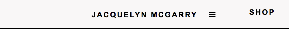
<div class="topnav" id="myTopnav"> <div class="topnav-centered"> <a href="index.html">JACQUELYN MCGARRY</a> </div> <div class="topnav-right"> <a href="shop.html">SHOP</a> <a href="work.html">WORK</a> </div> <a href="about.html">ABOUT</a> <a href="contact.html">CONTACT</a> <a href="javascript:void(0);" class="icon" onclick="myFunction()"><i class="fa fa-bars"></i> </a> </div> <script> function myFunction() { var x = document.getElementById("myTopnav"); if (x.className === "topnav") { x.className += " responsive"; } else { x.className = "topnav"; } } </script> .topnav { position: fixed; top: 0; width: 100%; padding: 0px; } .topnav a { float: left; display: block; text-align: center; padding: 14px 24px 12px 24px; } .topnav a:hover { padding: 12px 22px 10px 22px; } @media screen and (max-width: 600px) { .topnav a{ float: none; display: block; } .topnav-centered a { position: relative; top: 0; left: 0; transform: none; } .topnav-right a{ float: none; position: relative; } } .topnav .icon { display: none; } @media screen and (max-width: 500px) { .topnav a:not(:first-child) {display: none;} .topnav a.icon { float: left; display: block; } } .topnav-centered a { float: none; position: absolute; top: 50%; left: 50%; transform: translate(-50%, -50%); } .topnav-right { float: right; } @media screen and (max-width: 500px) { .topnav.responsive {position: fixed;} .topnav.responsive .icon { position: absolute; right: 0; top: 0; } .topnav.responsive a { float: none; display: block; /* text-align: left;*/ } } My float right menu items don't nest in the hamburger menu. I tried float:left on mobile for topnav-right with no luck. I have no idea how to fix it. Code has been personalized from w3schools tutorials


-
I have a fixed menu with a centered logo, left and right menu items. My float right menu items are showing beside the hamburger menu on responsive/mobile settings. The menu uses float: right for positioning the hamburger menu and the menu items. <div class="topnav" id="myTopnav"> <div class="topnav-centered"> <a href="index.html">JACQUELYN MCGARRY</a> </div> <div class="topnav-right"> <a href="shop.html">SHOP</a> <a href="work.html">WORK</a> </div> <a href="about.html">ABOUT</a> <a href="contact.html">CONTACT</a> <a href="javascript:void(0);" class="icon" onclick="myFunction()"><i class="fa fa-bars"></i> </a> </div> <script> function myFunction() { var x = document.getElementById("myTopnav"); if (x.className === "topnav") { x.className += " responsive"; } else { x.className = "topnav"; } } </script> .topnav { position: fixed; top: 0; width: 100%; padding: 0px; background-color: #f9f7f7; overflow: hidden; text-transform: uppercase; letter-spacing: 2px; border-bottom-style: solid; border-width: 2px; } .topnav a { float: left; display: block; color: #000000; text-align: center; padding: 14px 24px 12px 24px; text-decoration: none; font-size: 13px; font-weight: 900; font-style: normal; } .topnav a:hover { padding: 12px 22px 10px 22px; border-style: solid; border-width: 2px; border-radius: 50%; color: #101010; } .topnav .icon {display: none;} @media screen and (max-width: 600px) { .topnav a{ float: none; display: block; } .topnav-centered a { position: relative; top: 0; left: 0; transform: none; } } @media screen and (max-width: 600px) { .topnav-right { background-color: red; float: none; } } .topnav-centered a { float: none; position: absolute; top: 50%; left: 50%; transform: translate(-50%, -50%); } .topnav-right { float: right; } @media screen and (max-width: 500px) { .topnav a:not(:first-child) {display: none;} .topnav a.icon { float: left; display: block; } } @media screen and (max-width: 500px) { .topnav.responsive {position: fixed;} .topnav.responsive .icon { position: absolute; right: 0; top: 0; } .topnav.responsive a { float: none; display: block; /* text-align: left;*/ } }